Théo Hennequin

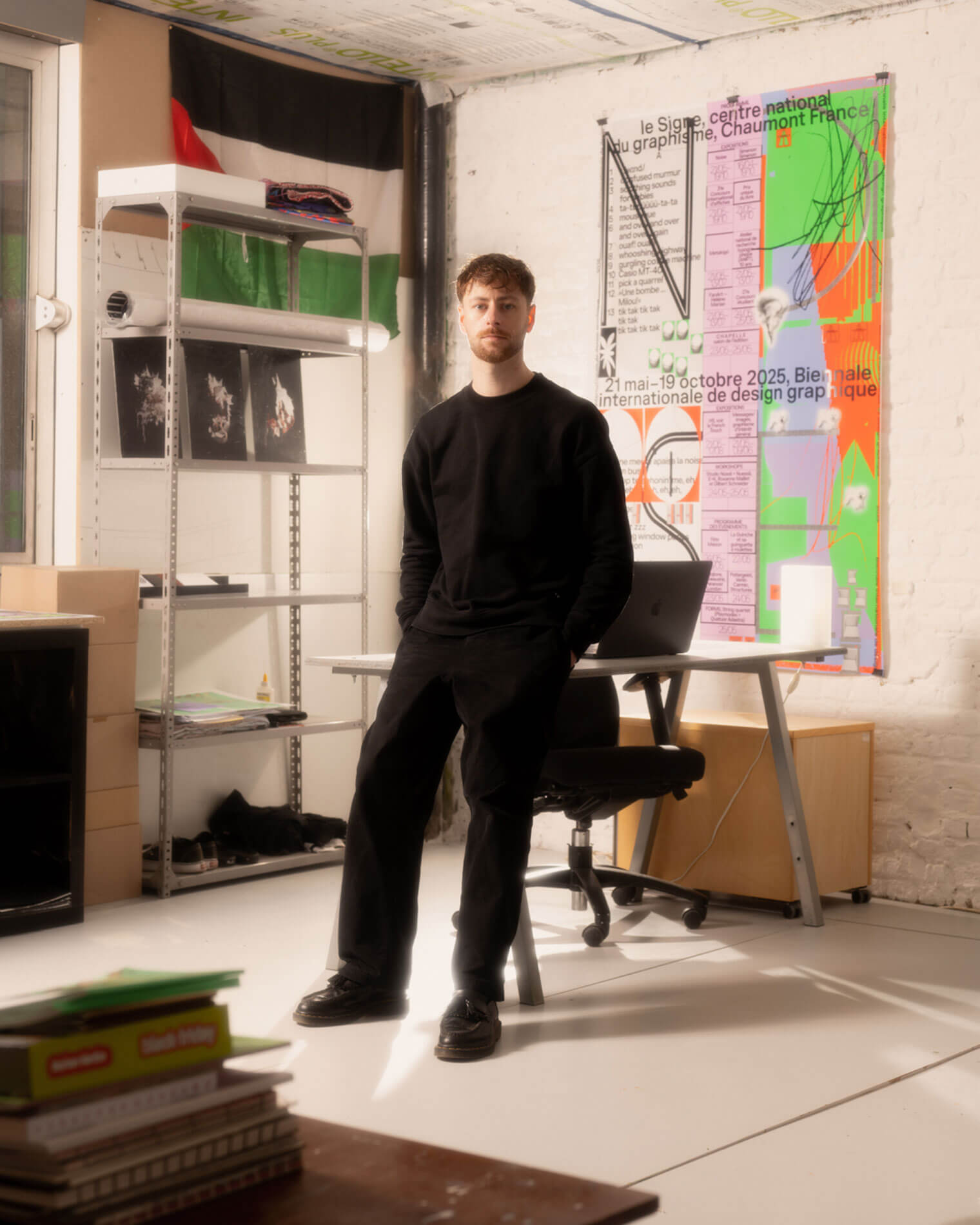
Théo Hennequin is a Brussels-based graphic designer and visual artist with a conceptually driven practice spanning culture, music and sport. He collaborates with institutions, artists, festivals and collectives, from major museums to independent structures, to articulate distinctive positions across print, digital and motion.

His practice is rooted in the circulation of images and forms between swiss rigour, experimental layering and popular cultures, from the football stand to the mountain trail, using the distance between them as a space for inquiry.


Services

Visual identity: Creation of cohesive and distinctive visual identity systems — logos, brand guidelines, posters, and print and digital applications.
Editorial design: Content layout and reflection on the physical form — books, catalogues, magazines, zines.
Motion design: Bringing images and identities to life — motion design, teasers, animated posters, projected visuals.
Web design: Custom website design, tailored to the project’s identity — portfolios, festivals, galleries, collective platforms.
Typeface design: Bespoke lettering design — brand fonts, display typefaces, lettering.

Commission

Please contact me so that I can put my skills to work for you.

Collaboration

Currently available on a freelance basis for collaborations.

Contact

hello@theohennequin.com
@theohennequin
Rue Jacques de Lalaing 13, 1040 Brussels

Selected clients

Affenpinshers, Africa Museum, Argos, Entwined, Harlem Lamine, Johan Poezevara, La Bellone, Les Chantiers Battus, Les Îles Mardi, Musique Action Chaumont, Palais de Tokyo, Traumnovelle, Toestand...
About

Berliner Mauer

2019, Berlin

Font: Kaffi (ECAL Typefaces)

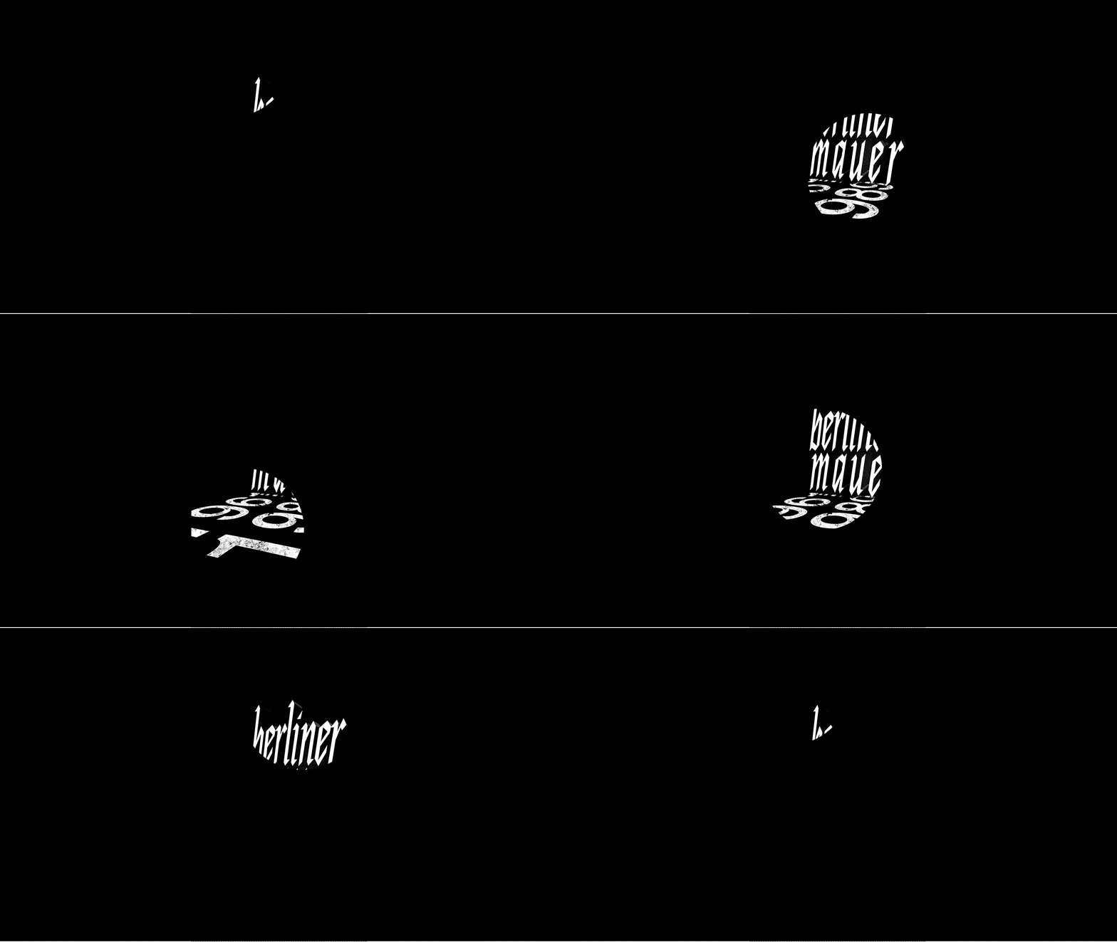
Animation against a black background: angular white fragments appear in the centre of the screen and expand to form the title ‘Berliner Mauer’

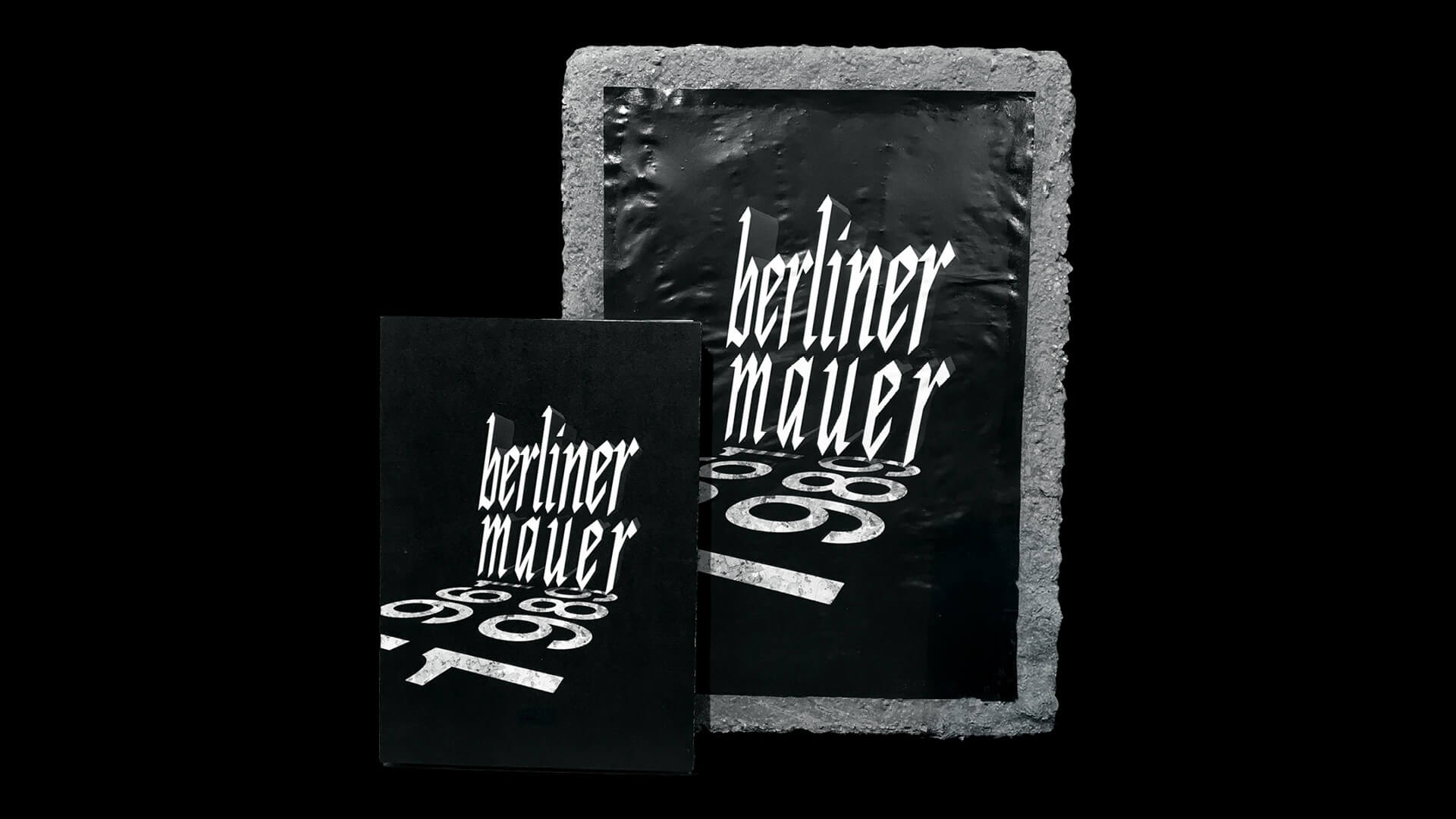
Berliner Mauer commemorates the fall of the Berlin Wall in 1989. The project takes the form of a poster turned sculpture and a bilingual book, Le Mur de Berlin – Drôles d’histoires (Die Wand von Berlin – Komische Geschichten), which brings together a chronology, testimonies and archive photographs.

The poster becomes a volumetric object: mounted on a block of raw material, it takes on the physical, monumental presence of a fragment of the Wall and reactivates the sensory and memorial experience of the place. The title, in angular capitals with a Gothic feel, rises in perspective like a partition and casts its shadow over two dates carved in stone, lying on the ground. This volume sharpens the sense of fracture, separation and passage.

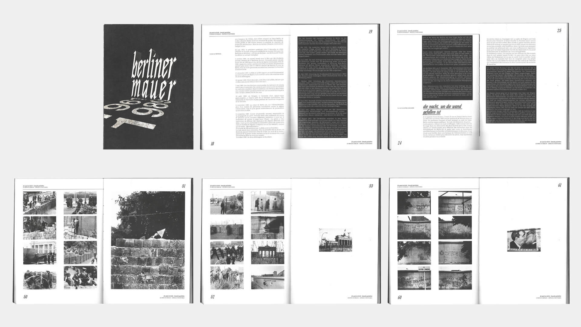
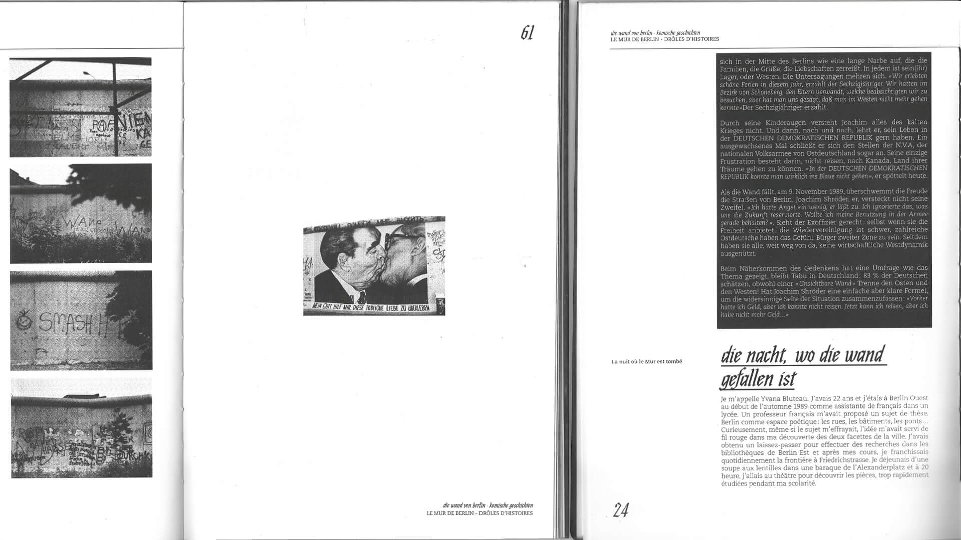
In the book, black and white share the page like the two sides of a wall: the German text reversed out of broad black blocks, the French on a white ground. The archive photographs, in a coarse halftone, are packed into grids on one page, facing a single image alone in the white.

A poster of the Berlin Wall stuck onto a block of grey raw material, next to the book with the black cover: the title, in angular, Gothic-style capital letters, stands out in perspective, like a partition, and casts its shadow over two dates engraved in the stone, lying on the ground
A spread comprising six pages and double-page spreads from the book The Berlin Wall – Funny Stories: the black cover; pages where the German text stands out in white against large black blocks, opposite the French text on a white background; and grids of black-and-white archive photographs opposite a single image
A double-page spread from the book: on the left, a grid of four photographs showing sections of the Wall covered in graffiti, followed by a blank page featuring a single small image of a mural; on the right, the chapter ‘The night the Wall came down’ in German in a black block, above the French text on a white background

Hexagone