Théo Hennequin

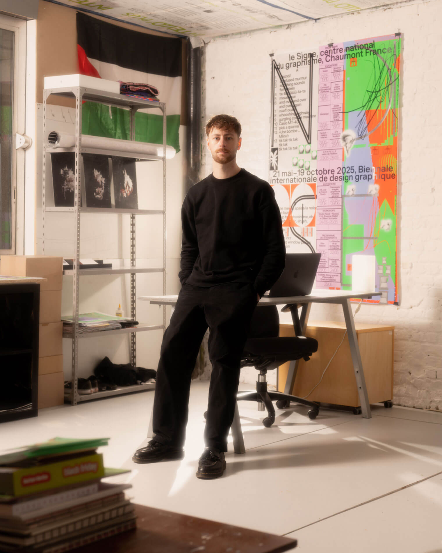
Théo Hennequin is a Brussels-based graphic designer and visual artist with a conceptually driven practice spanning culture, music and sport. He collaborates with institutions, artists, festivals and collectives, from major museums to independent structures, to articulate distinctive positions across print, digital and motion.

His practice is rooted in the circulation of images and forms between swiss rigour, experimental layering and popular cultures, from the football stand to the mountain trail, using the distance between them as a space for inquiry.


Services

Visual identity: Creation of cohesive and distinctive visual identity systems — logos, brand guidelines, posters, and print and digital applications.
Editorial design: Content layout and reflection on the physical form — books, catalogues, magazines, zines.
Motion design: Bringing images and identities to life — motion design, teasers, animated posters, projected visuals.
Web design: Custom website design, tailored to the project’s identity — portfolios, festivals, galleries, collective platforms.
Typeface design: Bespoke lettering design — brand fonts, display typefaces, lettering.

Commission

Please contact me so that I can put my skills to work for you.

Collaboration

Currently available on a freelance basis for collaborations.

Contact

hello@theohennequin.com
@theohennequin
Rue Jacques de Lalaing 13, 1040 Brussels

Selected clients

Affenpinshers, Africa Museum, Argos, Entwined, Harlem Lamine, Johan Poezevara, La Bellone, Les Chantiers Battus, Les Îles Mardi, Musique Action Chaumont, Palais de Tokyo, Traumnovelle, Toestand...
About

Entwined

2025, Brussels

Client: Entwined
Collaborators: Laurent Mbaah (graphic design and web development), Aurélie Defez (flag embroidery)
Font: Work Sans (Wei Huang)

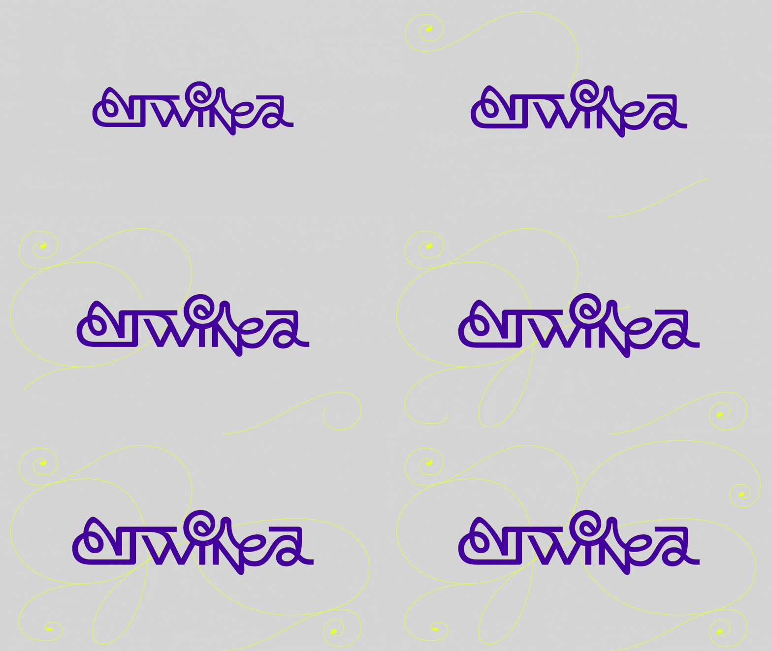
The Entwined logo in purple on a grey background: the word is drawn in a single continuous line, with the letters intertwining and curling around one another

Entwined is a Brussels-based collective of artists and curators. Through radio shows, DJ sets and podcasts, it brings together practices, sounds, images and bodies in motion.

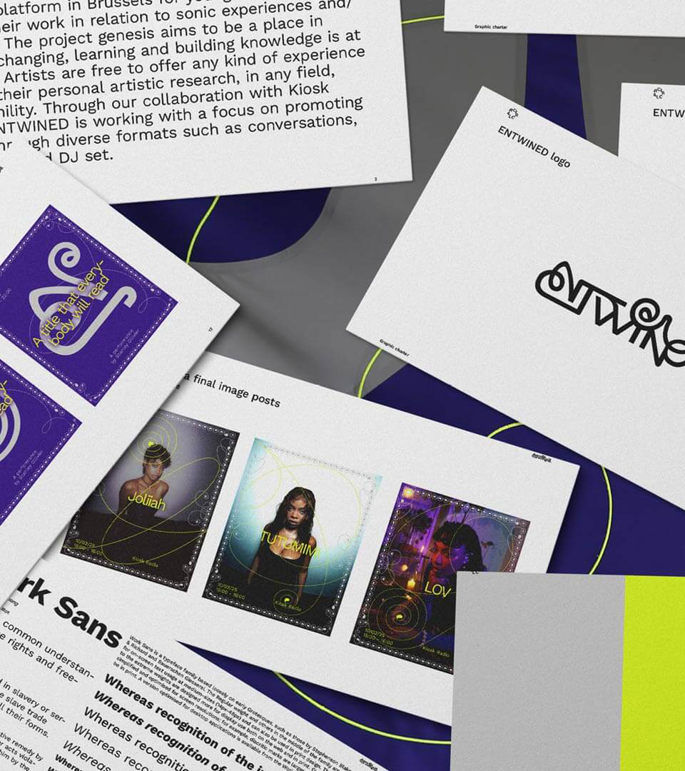
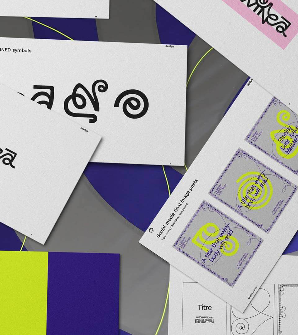
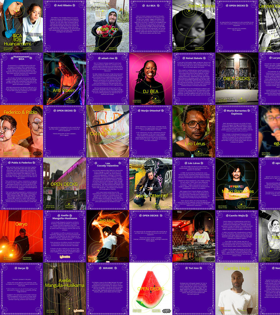
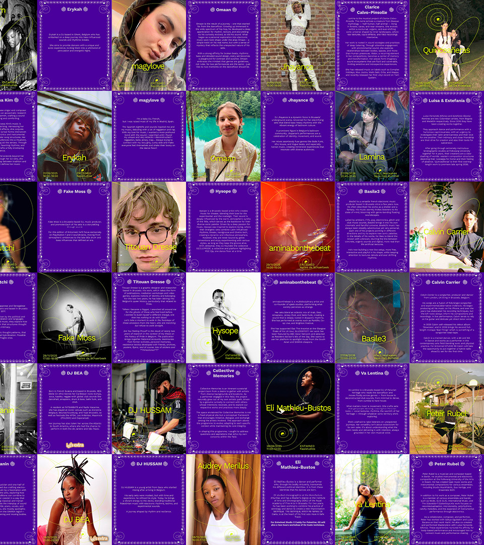
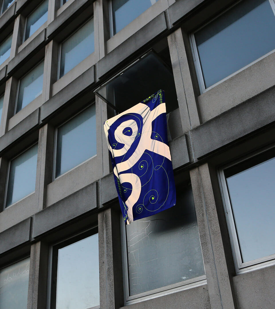
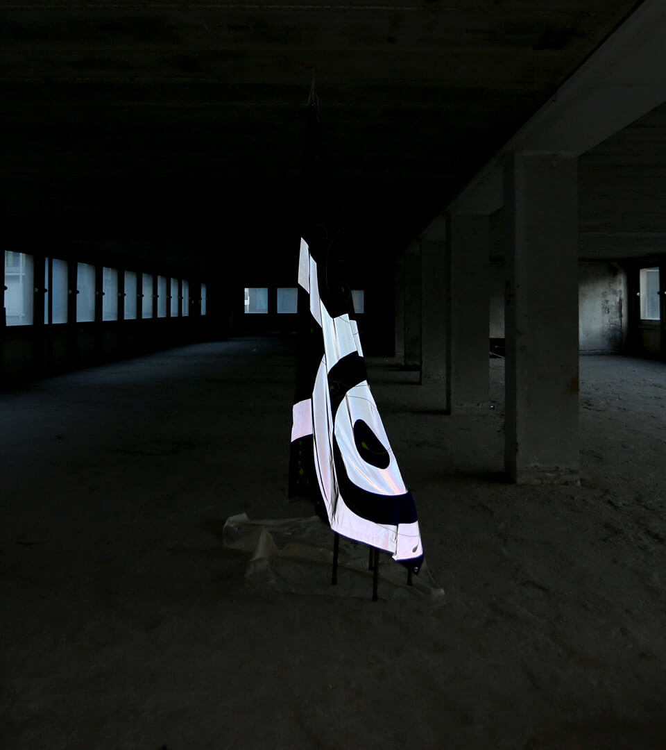
The visual identity takes entwining literally. The logotype is drawn in a single continuous line, its letters knotting and coiling; that line extends into symbols, into thin lines that orbit around the portraits, and into beaded borders that frame each image. The colour contrast is at once nocturnal and saturated: deep violet, acid yellow-green and grey. On social media, each artist gets two squares, a portrait and a biography, which alternate in a checkerboard. The website unrolls long violet threads around a carousel of posters and a highlighted index. The identity even extends to an embroidered flag, which lets these motifs float beyond the screen.

Printed pages from Entwined’s brand guidelines scattered across a purple and grey background criss-crossed with yellow-green lines: a black logo, a specimen of the Work Sans typeface, portraits of artists surrounded by beaded borders and spirals, and purple posters with yellow titles
Other pages in the style guide: black symbols with intertwined loops; grey publication templates with a purple beaded border and yellow-green symbols; a ‘Title’ template in line art; and solid patches of yellow-green and purple
A grid of social media posts: purple squares with beaded borders, alternating between artists’ portraits, names in yellow-green surrounded by spirals, biographies in plain text and ‘Open decks’ cards
Continuing the same pattern of publications: further portraits of guest artists and their biographies, alternating against a purple background with a beaded border
A midnight blue and holographic grey flag, featuring a large spiral symbol and small acid-green spirals, hanging from a window on a concrete façade
The embroidered flag, illuminated from behind, standing on a stand in the middle of a large, dark concrete platform with columns and illuminated windows

Les Îles Mardi