Théo Hennequin

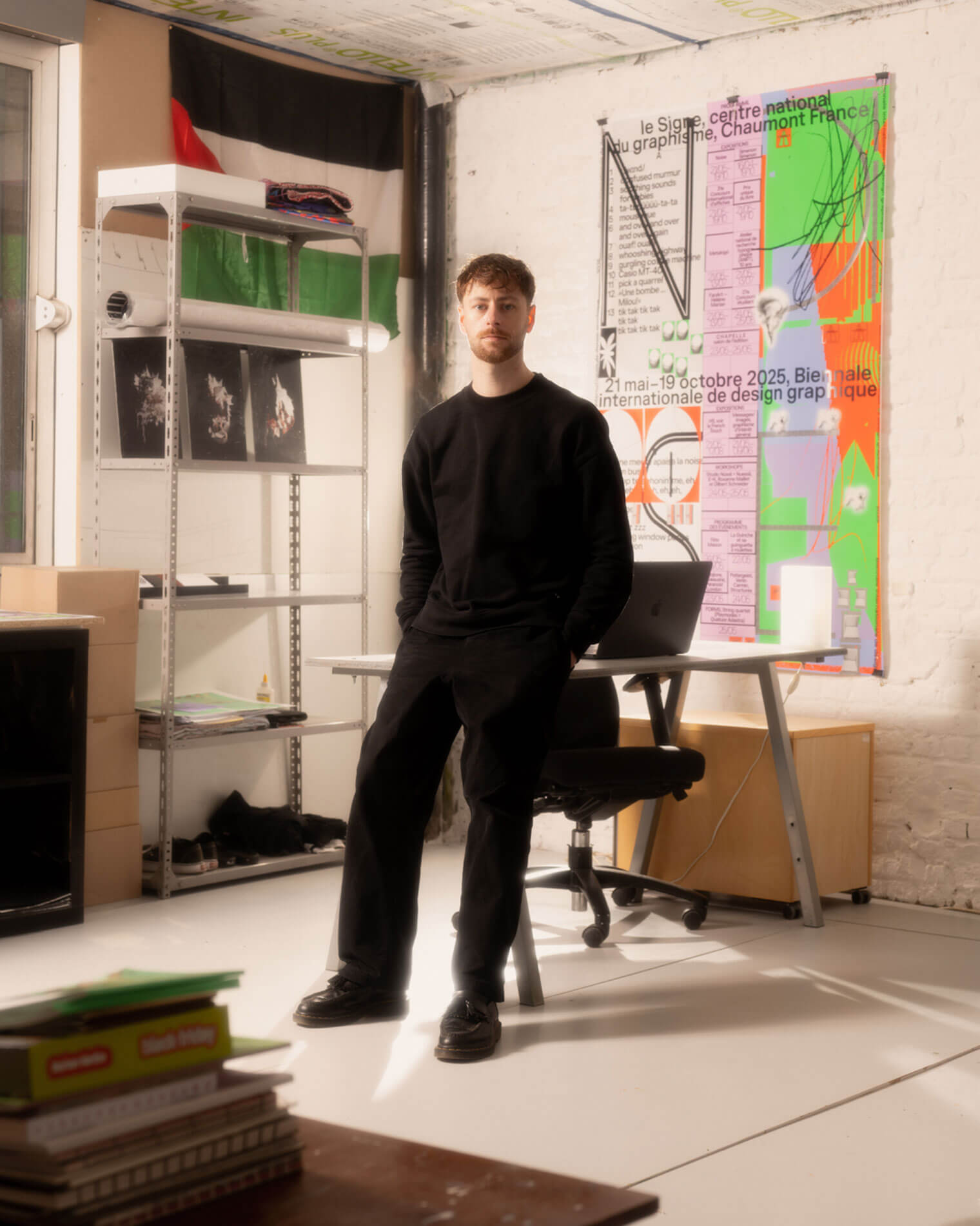
Théo Hennequin is a Brussels-based graphic designer and visual artist with a conceptually driven practice spanning culture, music and sport. He collaborates with institutions, artists, festivals and collectives, from major museums to independent structures, to articulate distinctive positions across print, digital and motion.

His practice is rooted in the circulation of images and forms between swiss rigour, experimental layering and popular cultures, from the football stand to the mountain trail, using the distance between them as a space for inquiry.


Services

Visual identity: Creation of cohesive and distinctive visual identity systems — logos, brand guidelines, posters, and print and digital applications.
Editorial design: Content layout and reflection on the physical form — books, catalogues, magazines, zines.
Motion design: Bringing images and identities to life — motion design, teasers, animated posters, projected visuals.
Web design: Custom website design, tailored to the project’s identity — portfolios, festivals, galleries, collective platforms.
Typeface design: Bespoke lettering design — brand fonts, display typefaces, lettering.

Commission

Please contact me so that I can put my skills to work for you.

Collaboration

Currently available on a freelance basis for collaborations.

Contact

hello@theohennequin.com
@theohennequin
Rue Jacques de Lalaing 13, 1040 Brussels

Selected clients

Affenpinshers, Africa Museum, Argos, Entwined, Harlem Lamine, Johan Poezevara, La Bellone, Les Chantiers Battus, Les Îles Mardi, Musique Action Chaumont, Palais de Tokyo, Traumnovelle, Toestand...
About

Les Îles Mardi

2026, Brussels

Client: Les Îles Mardi
Collaborators: Greta oto (web development)
Font: Inclusive Sans (Olivia King)
Photographies: Johan Poezevara

Les Îles Mardi is an artists’ studio space and a cooperative in Brussels. Run by and for artists, it now hosts around forty multidisciplinary artists and operates as a platform dedicated to exchange, collaboration, horizontality and mutual solidarity.

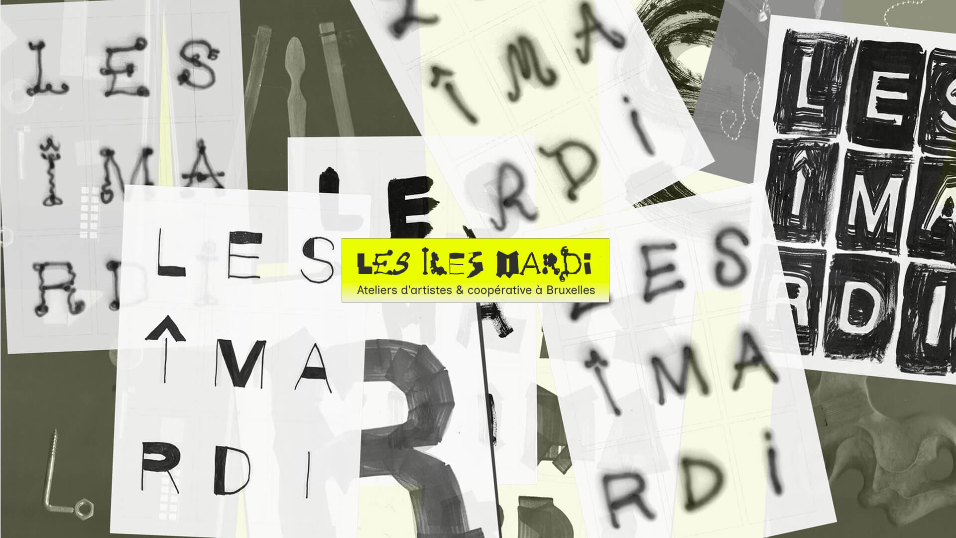
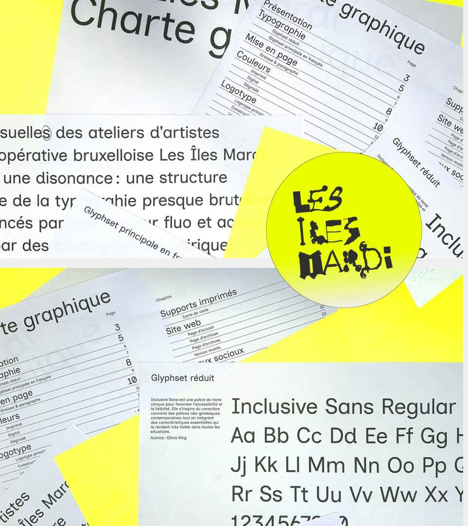
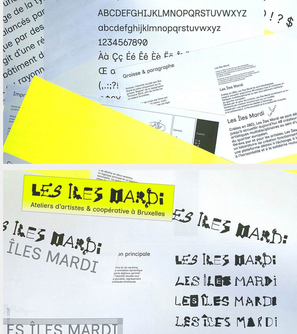
Following a workshop with members of Les Îles Mardi, we designed the cooperative’s visual identity, brand guidelines and website. The identity is built on dissonance. On one side, an almost brutalist structure and typography; on the other, a logotype in which each letter is drawn differently, like so many studio gestures and tools, and which comes in several versions and as an animation. An acid yellow brings the energy of the place. The website works like a directory: members can be filtered by practice, and overlapping yellow windows bring the news to life.

A collage of overlapping sheets on a khaki-green background, on which the name ‘Les Îles Mardi’ is rendered in a variety of ways: marker pen, paintbrush, spray paint, thread, amongst other studio tools. In the centre, the logo on a fluorescent yellow banner reads ‘Artists’ studios & co-operative in Brussels’
Printed pages from the Îles Mardi brand guidelines scattered across fluorescent yellow backgrounds: table of contents, an introduction to the Inclusive Sans typeface with its alphabet, and a round yellow circle bearing the logo
Other pages in the style guide: the Inclusive Sans alphabet, numerals and accented characters; guidelines on font weights and paragraph formatting; the colour chart; and variations of the hand-drawn lettering logo, including the version on a fluorescent yellow banner

Mura Masa Antwerp