Théo Hennequin

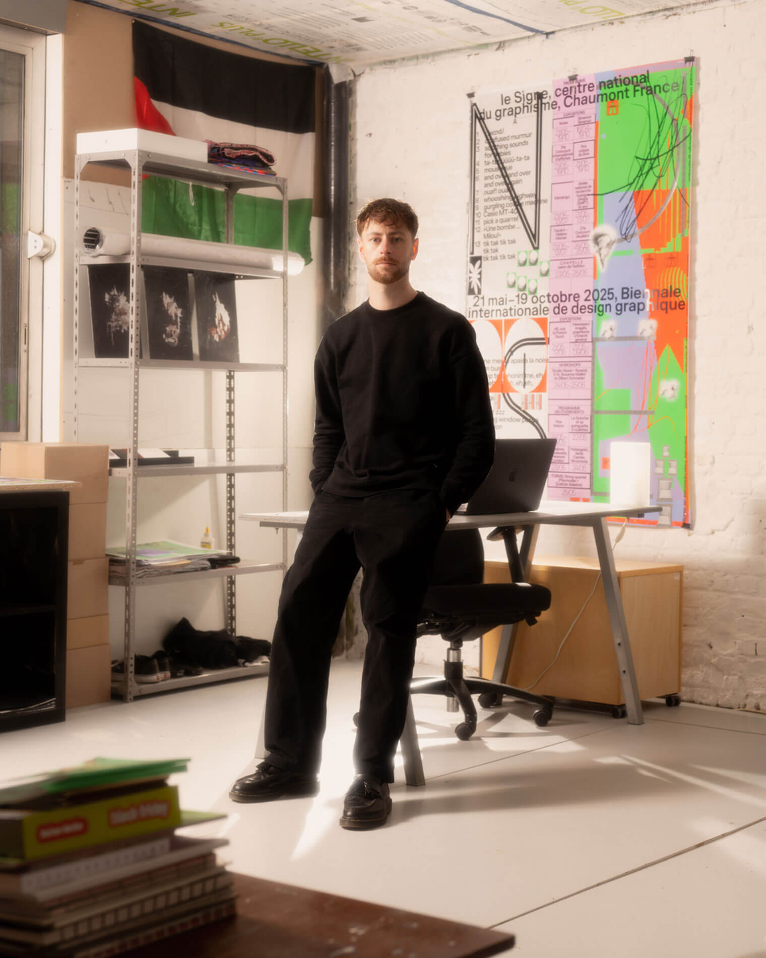
Théo Hennequin is a Brussels-based graphic designer and visual artist with a conceptually driven practice spanning culture, music and sport. He collaborates with institutions, artists, festivals and collectives, from major museums to independent structures, to articulate distinctive positions across print, digital and motion.

His practice is rooted in the circulation of images and forms between swiss rigour, experimental layering and popular cultures, from the football stand to the mountain trail, using the distance between them as a space for inquiry.


Services

Visual identity, editorial design, motion design, web design, typeface design

Commission

Please contact me so that I can put my skills to work for you.

Collaboration

Currently available on a freelance basis for collaborations.

Contact

hello@theohennequin.com
@theohennequin
Rue Jacques de Lalaing 13, 1040 Brussels

Selected clients

Affenpinshers, Africa Museum, Argos, Entwined, Harlem Lamine, Johan Poezevara, La Bellone, Les Chantiers Battus, Les Îles Mardi, Musique Action Chaumont, Palais de Tokyo, Traumnovelle, Toestand...
About

Harlem Lamine

2025

Client: Harlem Lamine
Collaborator: Laurent Mbaah (graphic design and web development)
Fonts: Helvetica (Max Miedinger), Messapia (Luca Marsano)

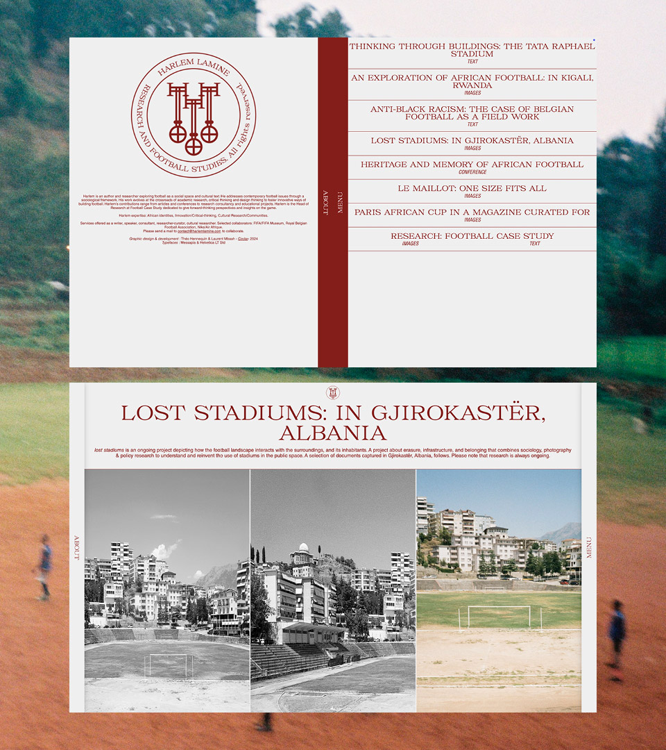
Harlem Lamine commissioned us to design his visual identity and website. Harlem is an author, speaker and consultant who explores football as a social space and cultural text. He addresses contemporary issues relating to football from a sociological perspective.

He commissioned us to design his visual identity and website.

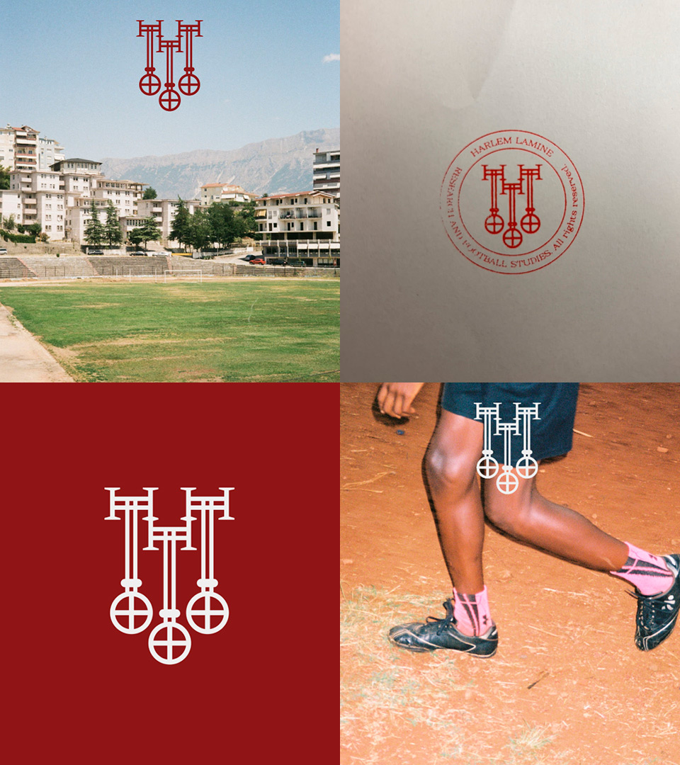
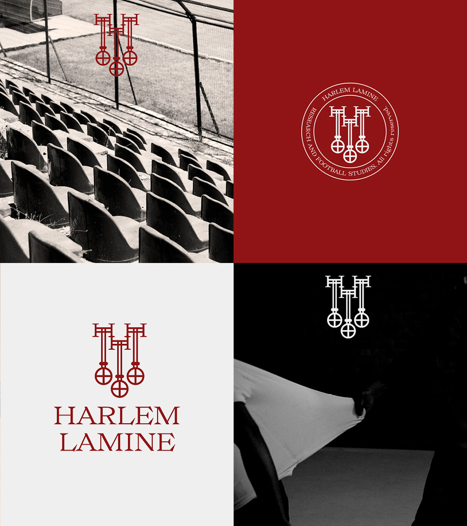
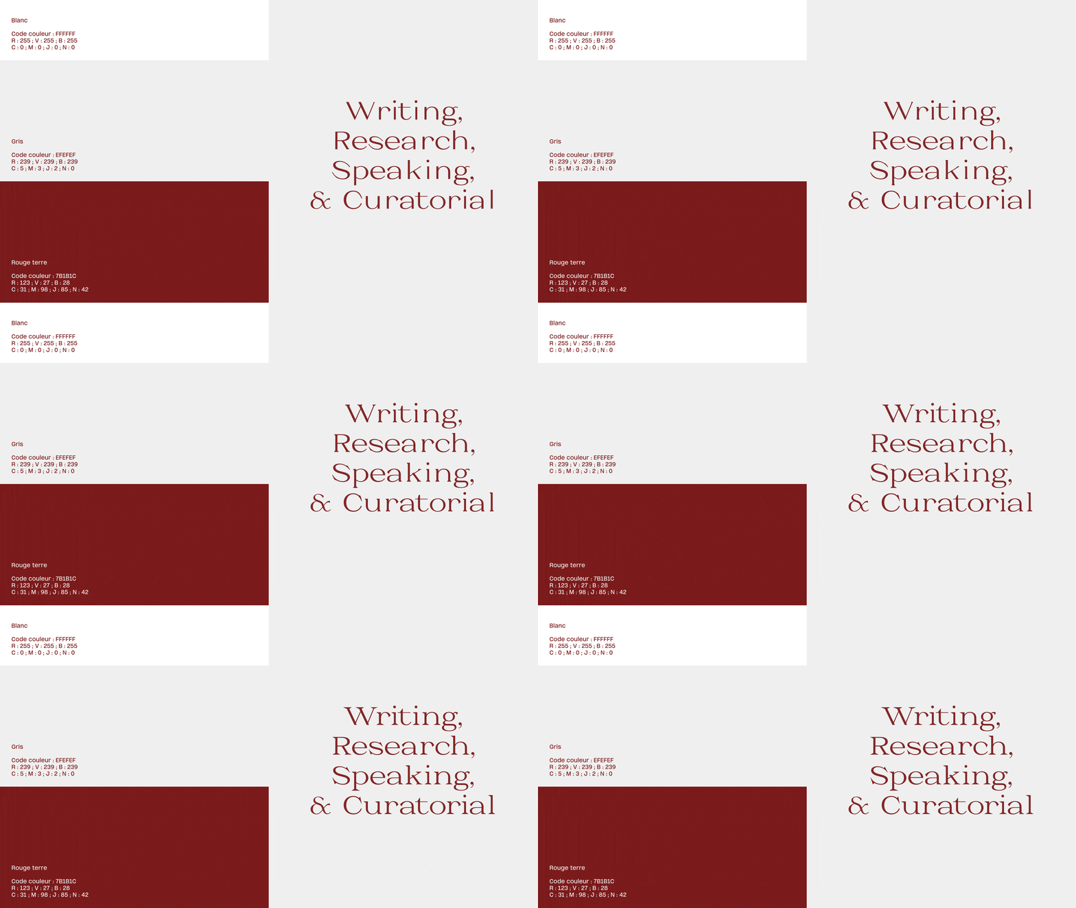
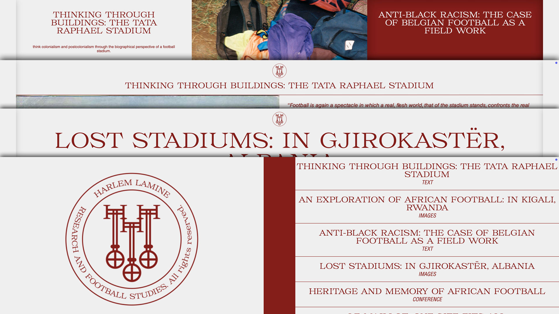
The identity gives fieldwork the framework of an institution. The monogram, an H built on three hanging keys, borrows from heraldry and the academic seal; turned into a circular stamp, it signs documents like an archive mark. Its authority comes from a deep red that echoes the clay of the pitches in the photographs, and from the engraved capitals of Messapia, while analogue photography (empty stadiums, terraces, players) tests it against the real.

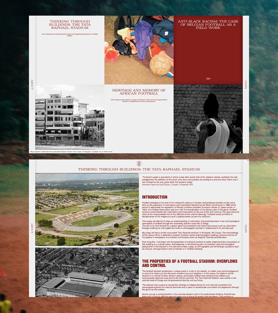
The website extends this logic. It reads like an archive: each piece of work (text, images, conference) is a catalogue entry, organised in a typographic menu. Messapia carries the titles and Helvetica the long-form reading of the essays, for academic rigour without decoration. Red, the interface’s only colour, ties the site to the identity and leaves room for the images.