Théo Hennequin

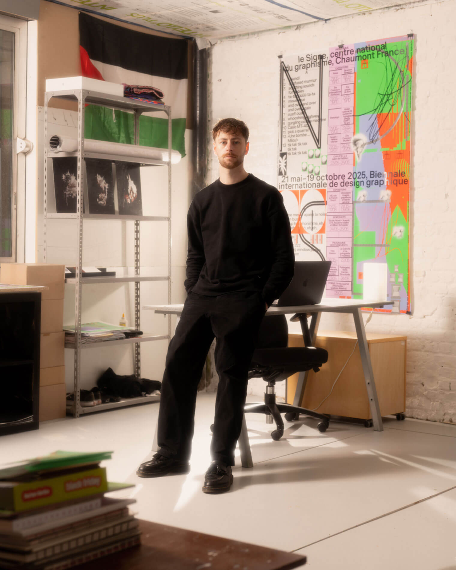
Théo Hennequin is a Brussels-based graphic designer and visual artist with a conceptually driven practice spanning culture, music and sport. He collaborates with institutions, artists, festivals and collectives, from major museums to independent structures, to articulate distinctive positions across print, digital and motion.

His practice is rooted in the circulation of images and forms between swiss rigour, experimental layering and popular cultures, from the football stand to the mountain trail, using the distance between them as a space for inquiry.


Services

Visual identity: Creation of cohesive and distinctive visual identity systems — logos, brand guidelines, posters, and print and digital applications.
Editorial design: Content layout and reflection on the physical form — books, catalogues, magazines, zines.
Motion design: Bringing images and identities to life — motion design, teasers, animated posters, projected visuals.
Web design: Custom website design, tailored to the project’s identity — portfolios, festivals, galleries, collective platforms.
Typeface design: Bespoke lettering design — brand fonts, display typefaces, lettering.

Commission

Please contact me so that I can put my skills to work for you.

Collaboration

Currently available on a freelance basis for collaborations.

Contact

hello@theohennequin.com
@theohennequin
Rue Jacques de Lalaing 13, 1040 Brussels

Selected clients

Affenpinshers, Africa Museum, Argos, Entwined, Harlem Lamine, Johan Poezevara, La Bellone, Les Chantiers Battus, Les Îles Mardi, Musique Action Chaumont, Palais de Tokyo, Traumnovelle, Toestand...
About

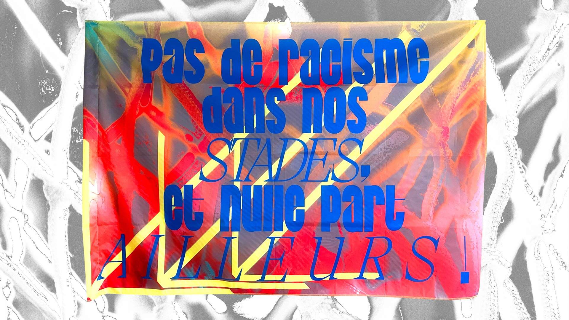
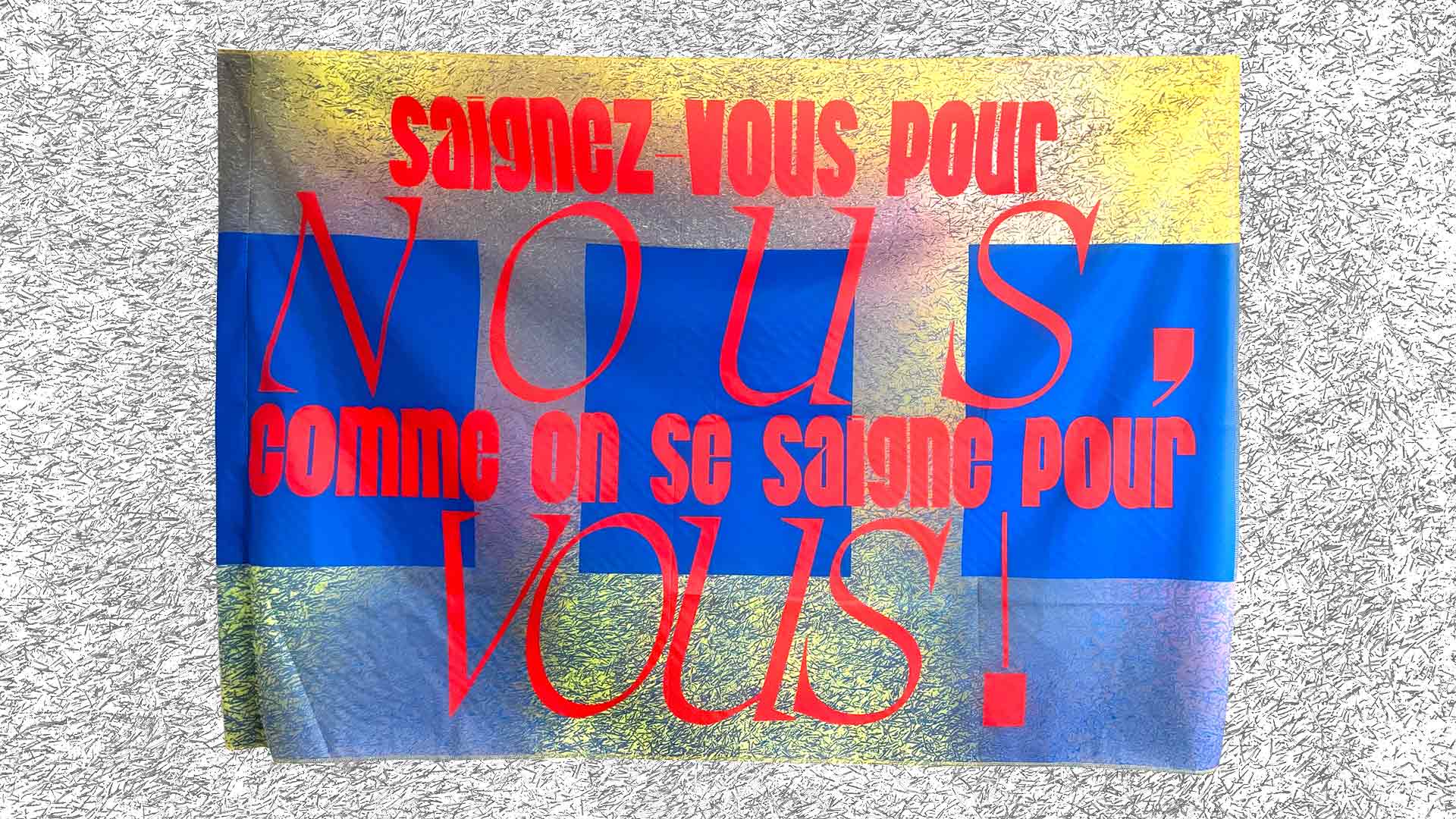
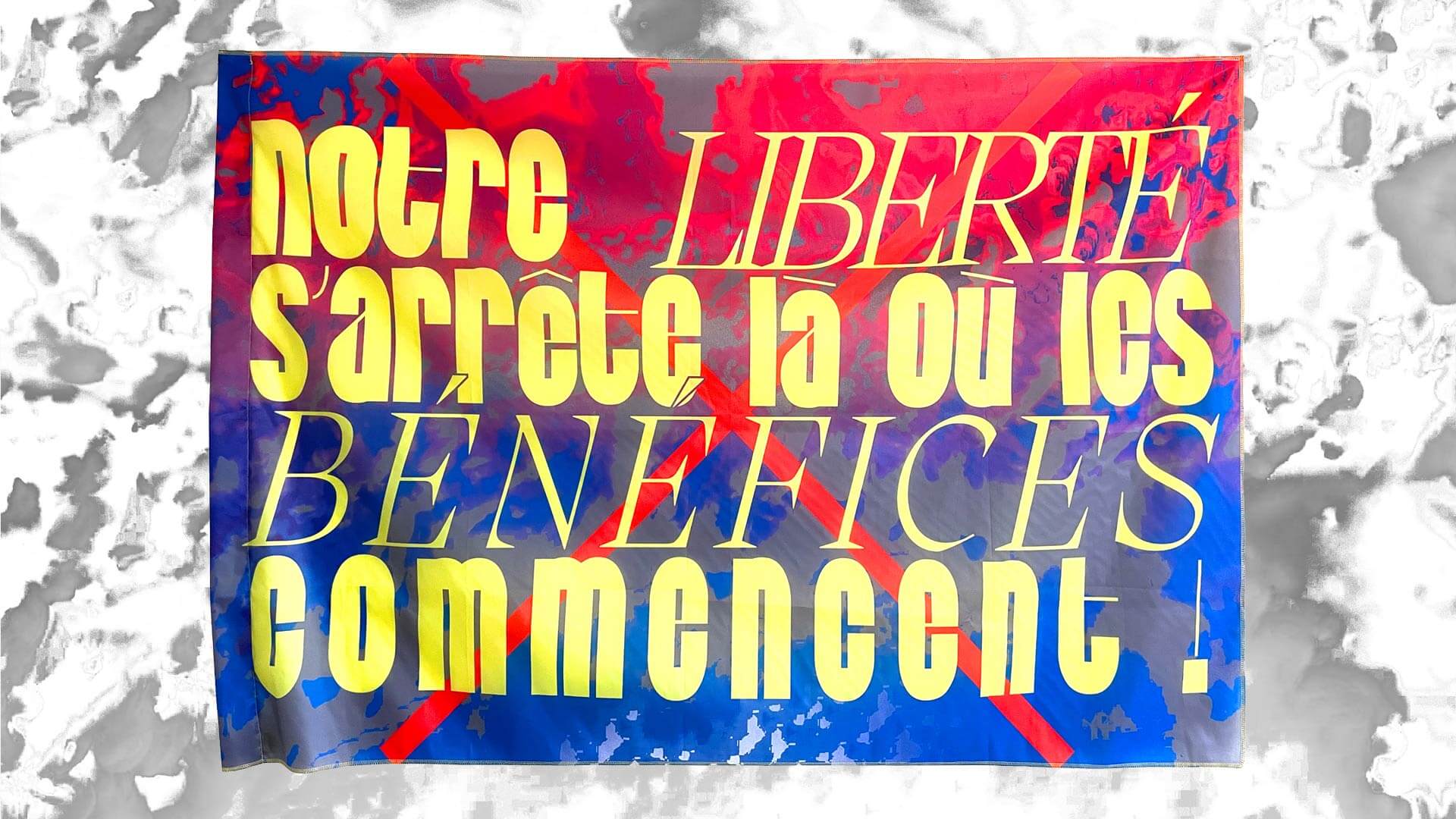
Fervent·es & Contestataires

2022, Brussels

Fonts: Cold (Théo Hennequin), Migra (Pangram Pangram - Valerio Monopoli)

A printed protest flag bearing the slogan ‘No racism in our stadiums, or anywhere else!’ in large blue letters, combining condensed and serif typefaces. The text stands out against an abstract red, orange and purple background criss-crossed by diagonal yellow stripes. The flag is shown against a black-and-white photographic background.

FERVENT·ES & CONTESTATAIRES is a flag project. At the heart of the project is a series of printed flags — a medium that symbolises both football supporters and protesters — highlighting shared demands: social critiques, solidarity and struggles common to these two spaces of collective expression.

An activist flag bearing the slogan ‘Look after yourselves for our sake, just as we look after you!’ in large red letters, alternating between condensed typefaces and serif italics. The design superimposes geometric blue blocks onto a metallic yellow, grey and silver background, with a crinkled, glossy texture. The flag is photographed against a textured grey background.
An activist flag bearing the slogan ‘Our freedom ends where profits begin!’ in large yellow letters, combining condensed typography with serif italics. The words take up almost the entire surface of the flag, set against an abstract blue, red and purple background criss-crossed by broad red diagonal lines. The flag is shown against a black-and-white photographic background.

Atlas oral