Théo Hennequin

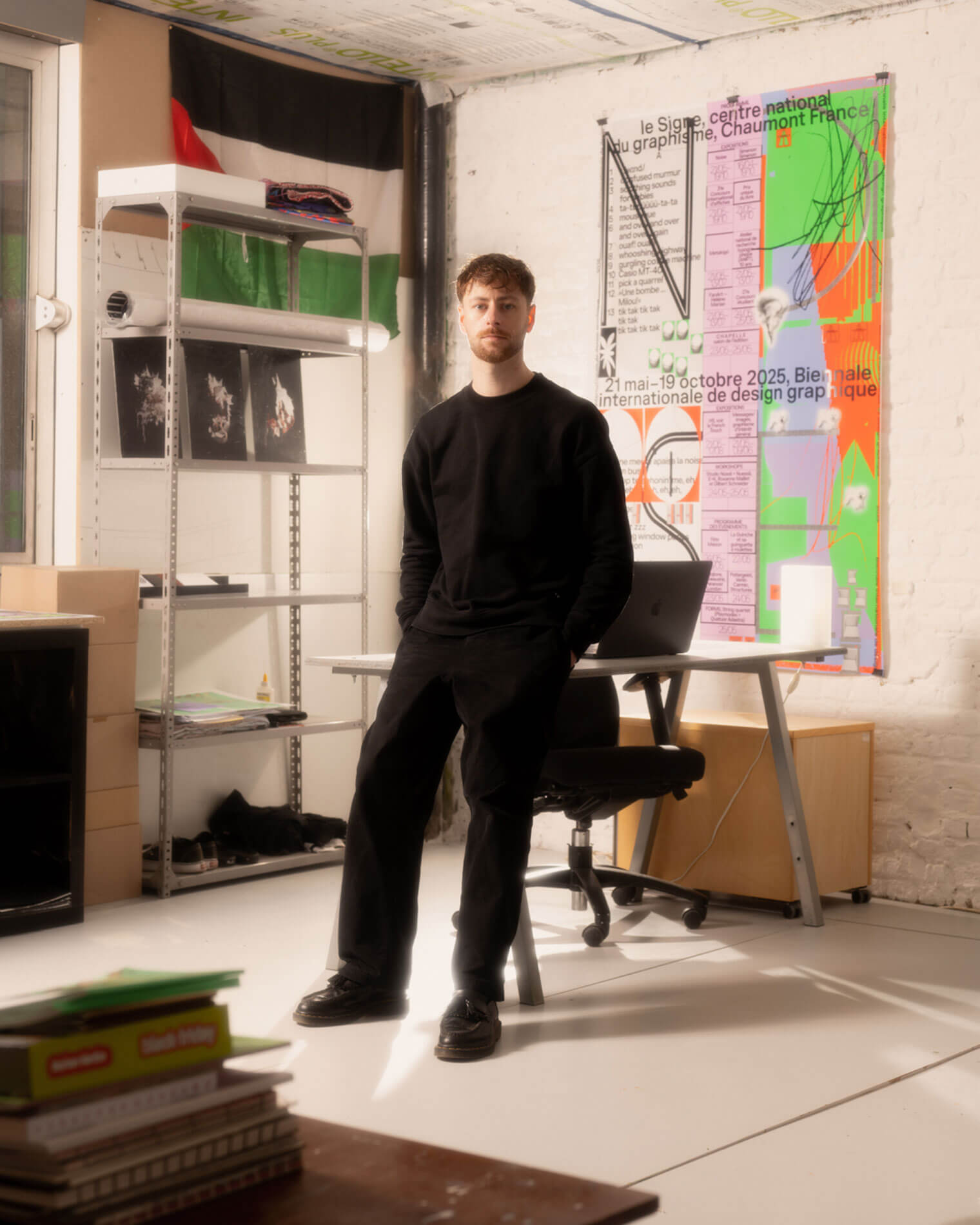
Théo Hennequin is a Brussels-based graphic designer and visual artist with a conceptually driven practice spanning culture, music and sport. He collaborates with institutions, artists, festivals and collectives, from major museums to independent structures, to articulate distinctive positions across print, digital and motion.

His practice is rooted in the circulation of images and forms between swiss rigour, experimental layering and popular cultures, from the football stand to the mountain trail, using the distance between them as a space for inquiry.


Services

Visual identity: Creation of cohesive and distinctive visual identity systems — logos, brand guidelines, posters, and print and digital applications.
Editorial design: Content layout and reflection on the physical form — books, catalogues, magazines, zines.
Motion design: Bringing images and identities to life — motion design, teasers, animated posters, projected visuals.
Web design: Custom website design, tailored to the project’s identity — portfolios, festivals, galleries, collective platforms.
Typeface design: Bespoke lettering design — brand fonts, display typefaces, lettering.

Commission

Please contact me so that I can put my skills to work for you.

Collaboration

Currently available on a freelance basis for collaborations.

Contact

hello@theohennequin.com
@theohennequin
Rue Jacques de Lalaing 13, 1040 Brussels

Selected clients

Affenpinshers, Africa Museum, Argos, Entwined, Harlem Lamine, Johan Poezevara, La Bellone, Les Chantiers Battus, Les Îles Mardi, Musique Action Chaumont, Palais de Tokyo, Traumnovelle, Toestand...
About

Hexagone

2018, Alpes

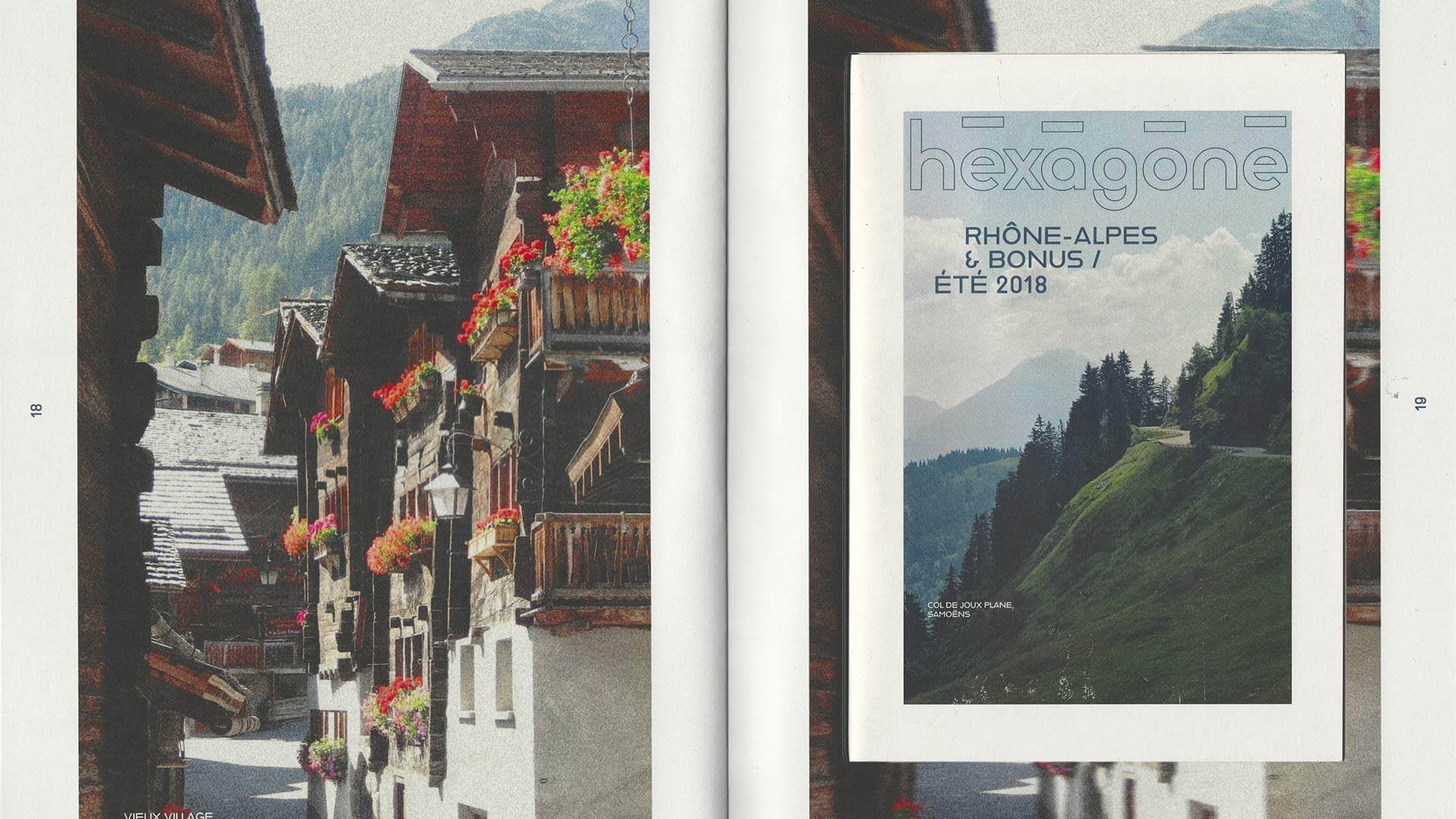
Cover of Hexagone magazine, ‘Rhône-Alpes & Bonus – Summer 2018’ issue, spread across a double-page spread: the title, rendered in outline, sits above a photograph of a wooded mountain pass, whilst the page below shows a village of wooden chalets with balconies adorned with geraniums

Hexagone is an editorial object about the Alps. Its issue “Rhône-Alpes & Bonus”, dated summer 2018, travels through Samoëns, Chamonix and, on the Swiss side, Grimentz, mixing resort architecture, flower-covered wooden villages and high-mountain landscapes.

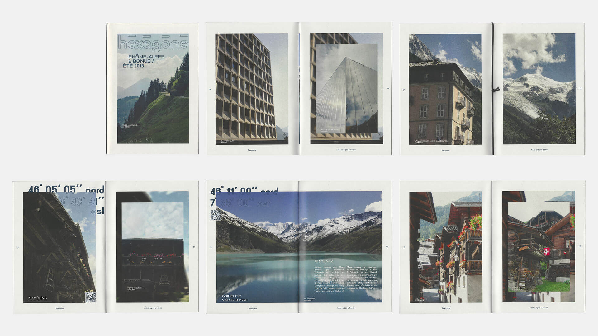
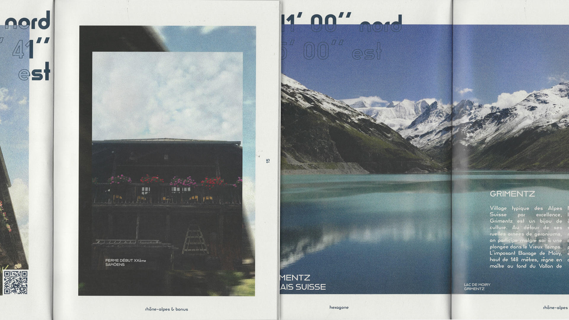
The layout borrows from the travel guide in order to subvert it. Geographic coordinates in large type, sometimes solid, sometimes outlined, open each place like a map reference. QR codes extend the object towards the real. The grainy photographs are layered over themselves: a smaller image sits on top of a wider crop, like a memory slipping out of register. The title, drawn in outline, keeps the rigour of a geometric typeface while letting the landscape show through.

Illustration for the cover and five double-page spreads of *Hexagone*: station buildings with lattice and mirrored façades, the Hôtel du Mont-Blanc and the Mont-Blanc ice cream parlour in Chamonix, a timber-framed farmhouse in Samoëns, Lake Moiry in Grimentz and a village with flower-bedecked chalets, featuring geographical coordinates in large type and QR codes
A detail of two double-page spreads from *Hexagone*: on the left, a timber-framed farmhouse with flower-filled balconies – a small photograph set within a wider frame of the same image – alongside geographical coordinates shown as an outline; on the right, Lake Moiry and its snow-capped peaks beneath a text introducing Grimentz

Dissonance