Théo Hennequin

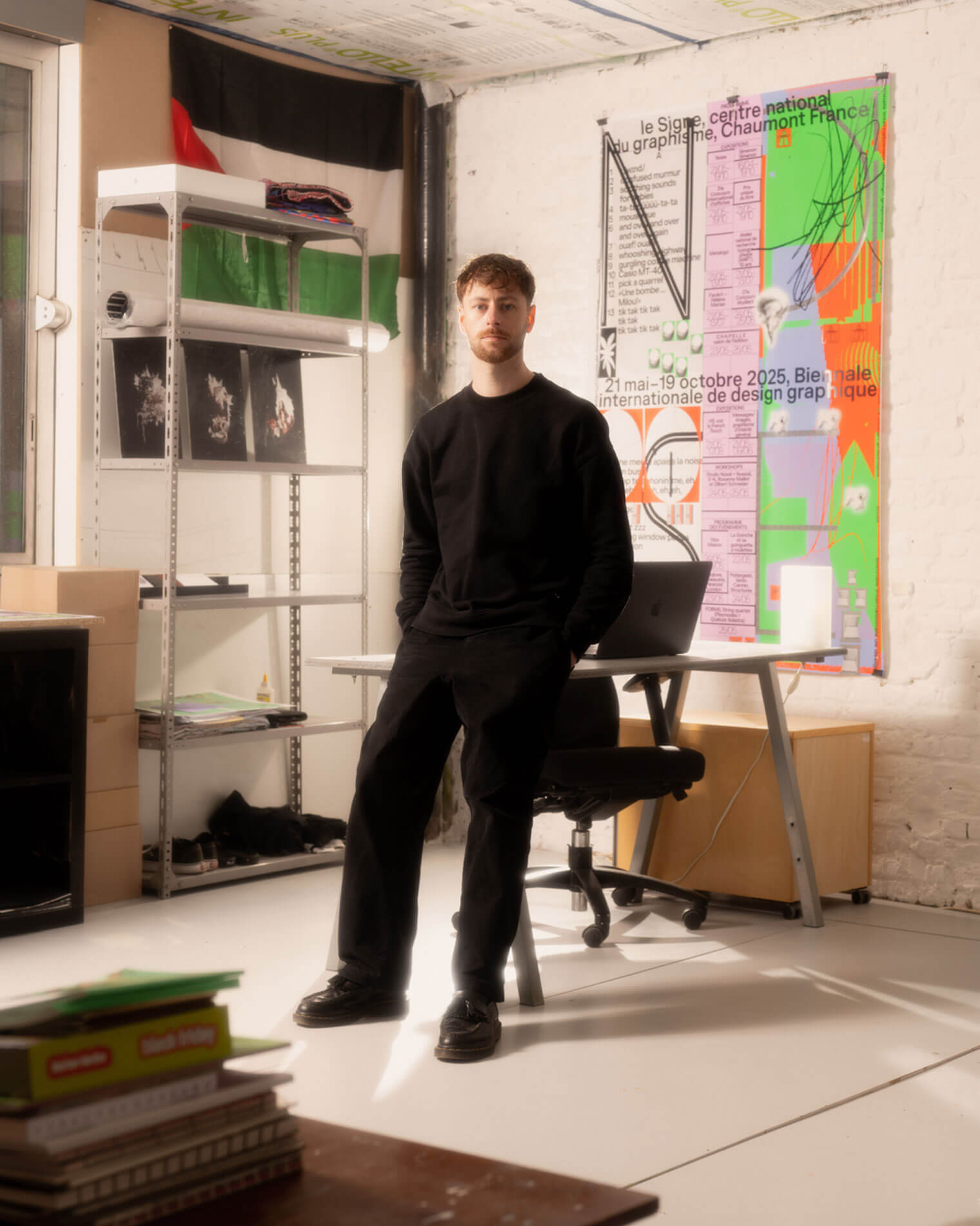
Théo Hennequin is a Brussels-based graphic designer and visual artist with a conceptually driven practice spanning culture, music and sport. He collaborates with institutions, artists, festivals and collectives, from major museums to independent structures, to articulate distinctive positions across print, digital and motion.

His practice is rooted in the circulation of images and forms between swiss rigour, experimental layering and popular cultures, from the football stand to the mountain trail, using the distance between them as a space for inquiry.


Services

Visual identity, editorial design, motion design, web design, typeface design

Commission

Please contact me so that I can put my skills to work for you.

Collaboration

Currently available on a freelance basis for collaborations.

Contact

hello@theohennequin.com
@theohennequin
Rue Jacques de Lalaing 13, 1040 Brussels

Selected clients

Affenpinshers, Africa Museum, Argos, Entwined, Harlem Lamine, Johan Poezevara, La Bellone, Les Chantiers Battus, Les Îles Mardi, Musique Action Chaumont, Palais de Tokyo, Traumnovelle, Toestand...
About

Chèr.es Artistes

2025

Client: 3ème vague
Collaborator: Laurent Mbaah (graphic design)
Font: Version C (Pizzatypefaces - Adrien Midzic and Laurène Girbal)
Photographies: Johan Poezevara

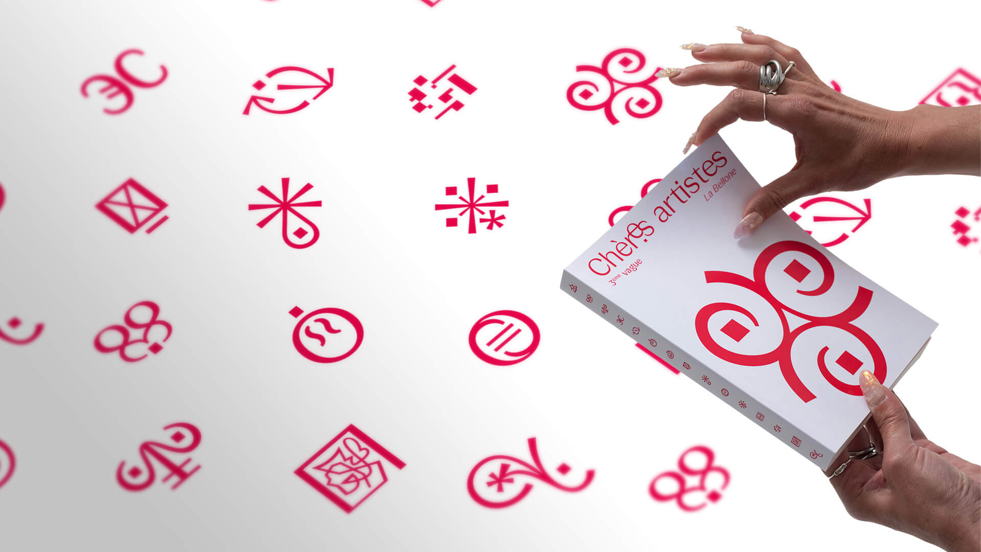
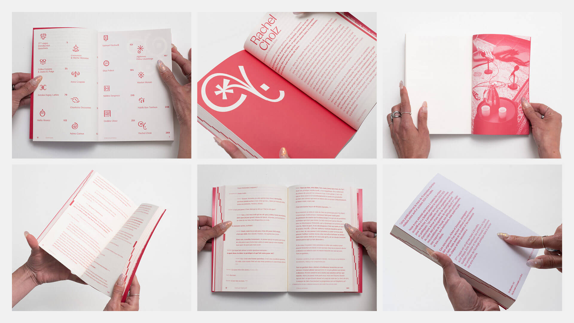
Chèr.es artistes is the trace of fifteen interviews with dramaturge artists, to invite them to share their intimate and political concerns. The interviews are organised around questions at the heart of the collective: working conditions, professional difficulties, relationships to institutions, but also joys and anger.

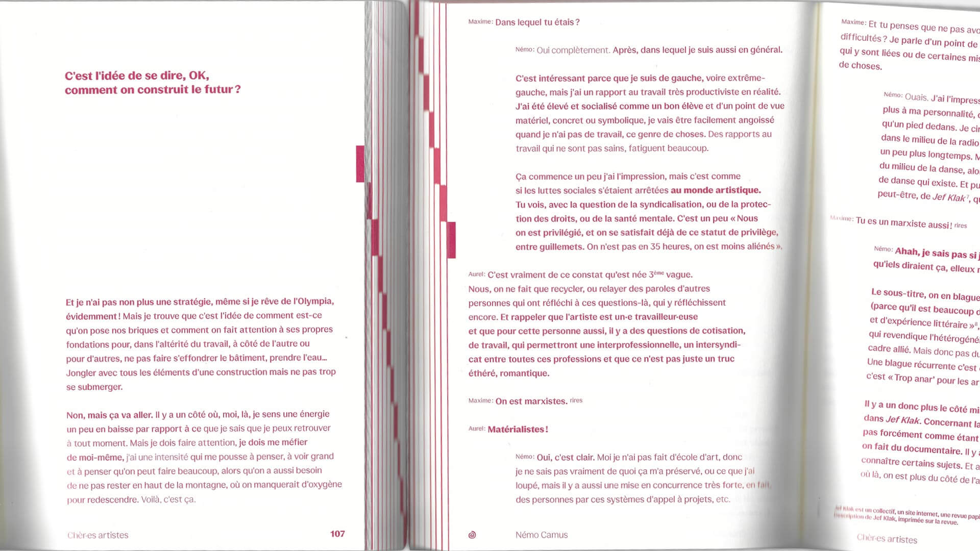
The identity composes an alphabet of fifteen signs: each artist has their own pictogram, which becomes their signature in the book. Gathered in a single graphic family, these signs convey the plurality of practices while keeping the collective form of the project. The typography lets the speech itself be read. The name of each speaker is set small before their line, and the type weight conveys the tone and volume of the voice: the stroke thickens when speech asserts itself and lightens when it softens. The typographic grey thus evolves over the course of the exchange, like a sound trace of the interview. Along the page edges, red markers line up to form a stepped pattern on the fore-edge of the closed book.