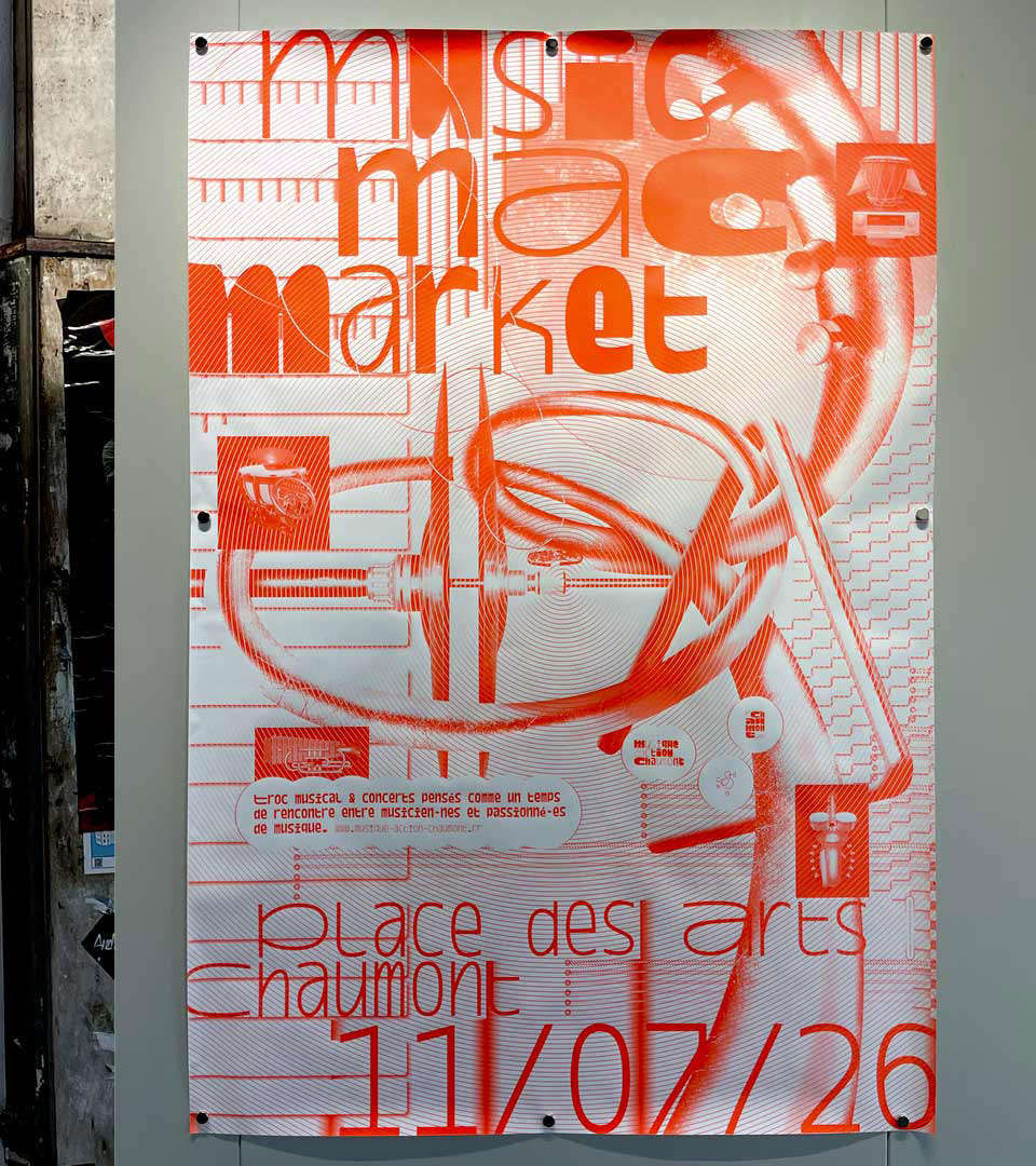
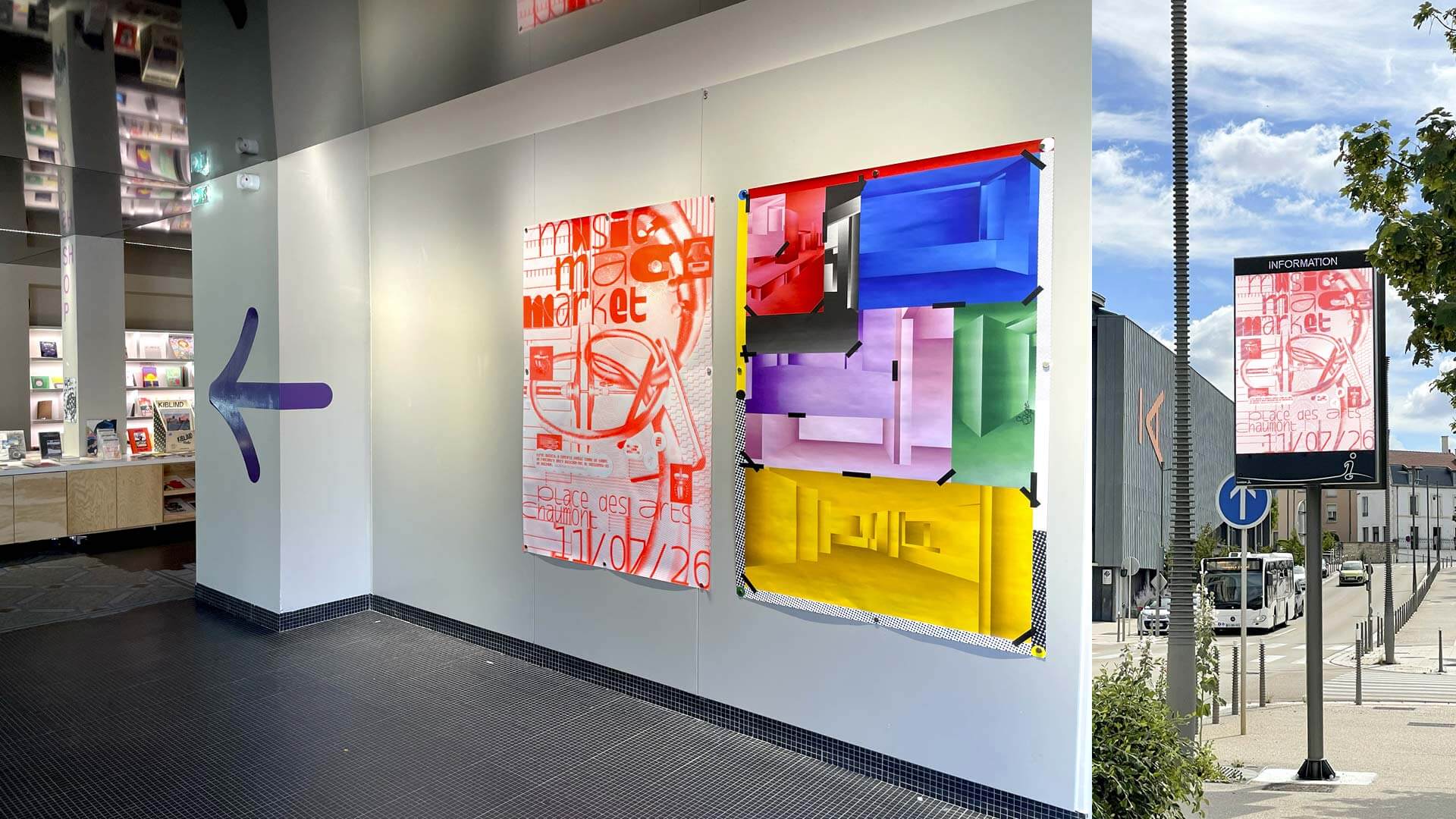
-
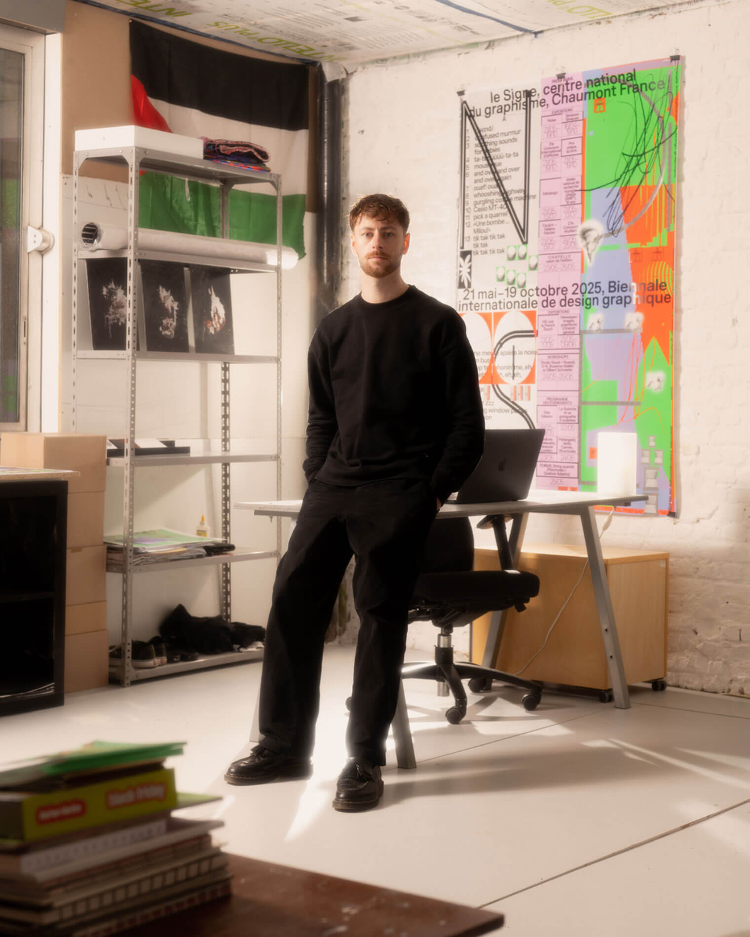
Théo Hennequin is a Brussels-based graphic designer and visual artist with a conceptually driven practice spanning culture, music and sport. He collaborates with institutions, artists, festivals and collectives, from major museums to independent structures, to articulate distinctive positions across print, digital and motion.
His practice is rooted in the circulation of images and forms between swiss rigour, experimental layering and popular cultures, from the football stand to the mountain trail, using the distance between them as a space for inquiry.
Services
Visual identity, editorial design, motion design, web design, typeface design
Commission
Please contact me so that I can put my skills to work for you.
Collaboration
Currently available on a freelance basis for collaborations.
Contact
hello@theohennequin.com
@theohennequin
Rue Jacques de Lalaing 13, 1040 Brussels
Selected clients
Affenpinshers, Africa Museum, Argos, Entwined, Harlem Lamine, Johan Poezevara, La Bellone, Les Chantiers Battus, Les Îles Mardi, Musique Action Chaumont, Palais de Tokyo, Traumnovelle, Toestand...
- FR