Théo Hennequin

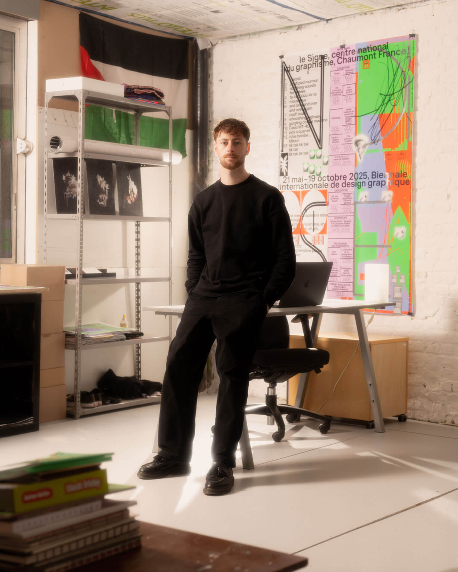
Théo Hennequin is a Brussels-based graphic designer and visual artist with a conceptually driven practice spanning culture, music and sport. He collaborates with institutions, artists, festivals and collectives, from major museums to independent structures, to articulate distinctive positions across print, digital and motion.

His practice is rooted in the circulation of images and forms between swiss rigour, experimental layering and popular cultures, from the football stand to the mountain trail, using the distance between them as a space for inquiry.


Services

Visual identity, editorial design, motion design, web design, typeface design

Commission

Please contact me so that I can put my skills to work for you.

Collaboration

Currently available on a freelance basis for collaborations.

Contact

hello@theohennequin.com
@theohennequin
Rue Jacques de Lalaing 13, 1040 Brussels

Selected clients

Affenpinshers, Africa Museum, Argos, Entwined, Harlem Lamine, Johan Poezevara, La Bellone, Les Chantiers Battus, Les Îles Mardi, Musique Action Chaumont, Palais de Tokyo, Traumnovelle, Toestand...
About

Tabula Rasa

2024

Client: Argos
Collaborators : Circlar, Laurent Mbaah and Marion Laser (graphic design)
Font: Kern (Pizzatypefaces - Adrien Midzic)

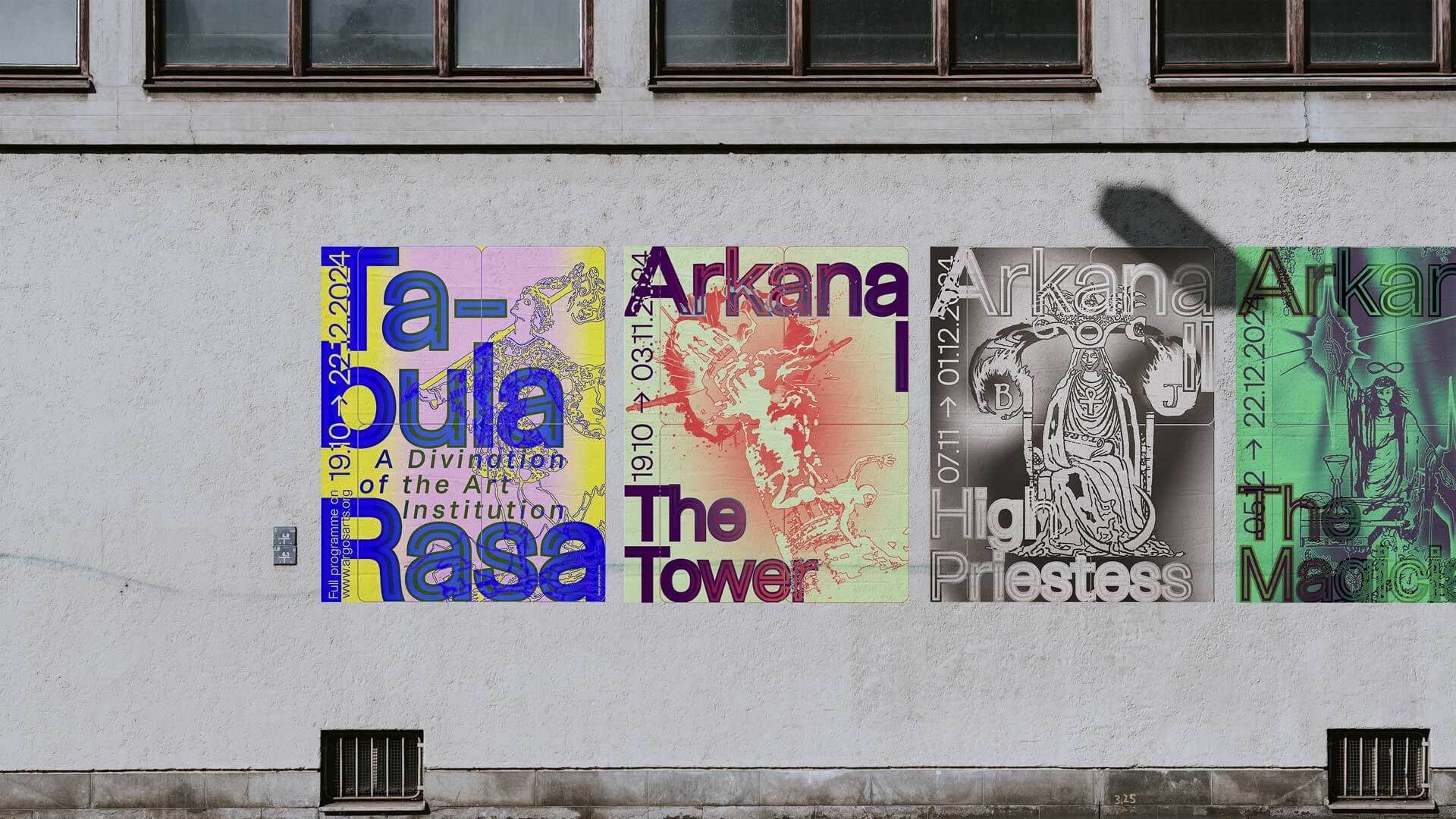
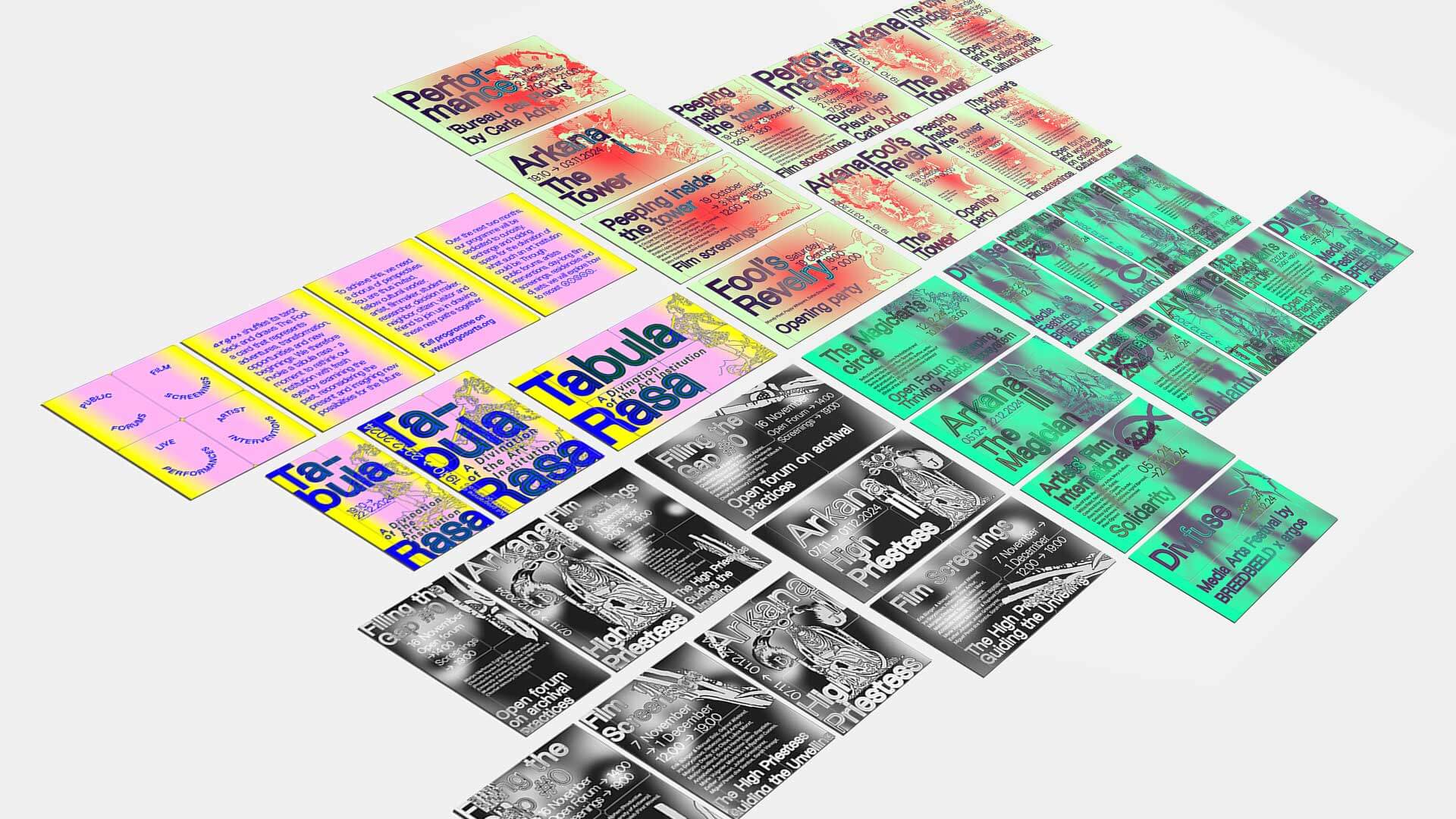
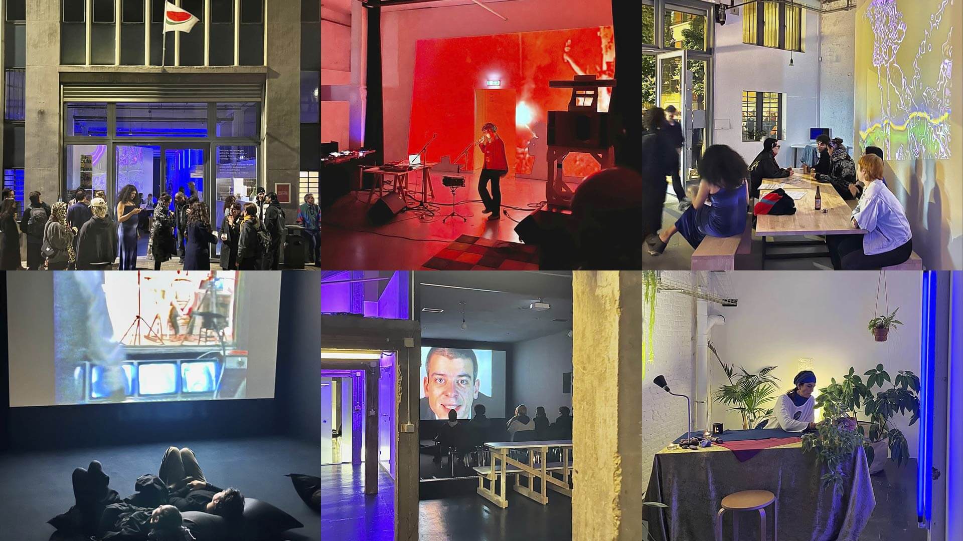
Tabula Rasa – A Divination of the Art Institution is the programme of Argos, a centre for audiovisual arts in Brussels, running from 19 October to 22 December 2024. Over two months, film screenings, public forums, artist interventions and performances are organised in three Arkanas, each placed under a tarot card: The Tower, The High Priestess, The Magician. To open the cycle, Argos shuffles its deck and draws The Fool, the card of transformation, adventure and new beginnings: a pretext to start again from a clean slate and rethink the institution by examining the past, reconsidering the present and imagining new possibilities.

The identity takes tarot as its structure. Each Arkana is given its card, its colour and its poster: yellow, pink and blue for The Fool, pale green and red-orange for The Tower, black and white for The High Priestess, bright green and violet for The Magician. The tarot engravings are redrawn as outlines, then blurred into soft gradients, like cards revealed as they are drawn. Over them, the typography (Kern), set very large, spills out of the frame: titles are broken, dates are turned vertical, letters are doubled with outlines that make the words vibrate. The palette changes with each Arkana, but the layout stays the same, so the series can be recognised from one wall to the next.