Théo Hennequin

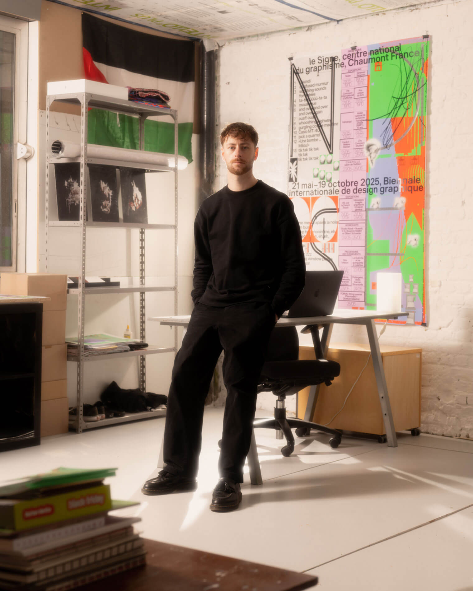
Théo Hennequin is a Brussels-based graphic designer and visual artist with a conceptually driven practice spanning culture, music and sport. He collaborates with institutions, artists, festivals and collectives, from major museums to independent structures, to articulate distinctive positions across print, digital and motion.

His practice is rooted in the circulation of images and forms between swiss rigour, experimental layering and popular cultures, from the football stand to the mountain trail, using the distance between them as a space for inquiry.


Services

Visual identity: Creation of cohesive and distinctive visual identity systems — logos, brand guidelines, posters, and print and digital applications.
Editorial design: Content layout and reflection on the physical form — books, catalogues, magazines, zines.
Motion design: Bringing images and identities to life — motion design, teasers, animated posters, projected visuals.
Web design: Custom website design, tailored to the project’s identity — portfolios, festivals, galleries, collective platforms.
Typeface design: Bespoke lettering design — brand fonts, display typefaces, lettering.

Commission

Please contact me so that I can put my skills to work for you.

Collaboration

Currently available on a freelance basis for collaborations.

Contact

hello@theohennequin.com
@theohennequin
Rue Jacques de Lalaing 13, 1040 Brussels

Selected clients

Affenpinshers, Africa Museum, Argos, Entwined, Harlem Lamine, Johan Poezevara, La Bellone, Les Chantiers Battus, Les Îles Mardi, Musique Action Chaumont, Palais de Tokyo, Traumnovelle, Toestand...
About

Fantasme & appropriation

2021, Cambrai

Font: Helvetica (Max Miedinger)

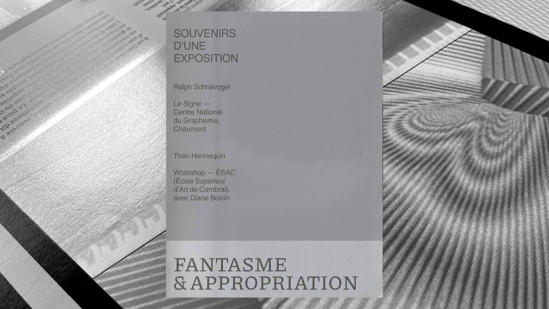
Grey cover of the book *Fantasme & appropriation*, subtitled ‘Memories of an exhibition’ and mentioning Ralph Schraivogel’s exhibition at Le Signe de Chaumont and the ÉSAC workshop; the title, in serif capital letters, appears at the bottom against a black-and-white background of enlarged pages featuring concentric lines

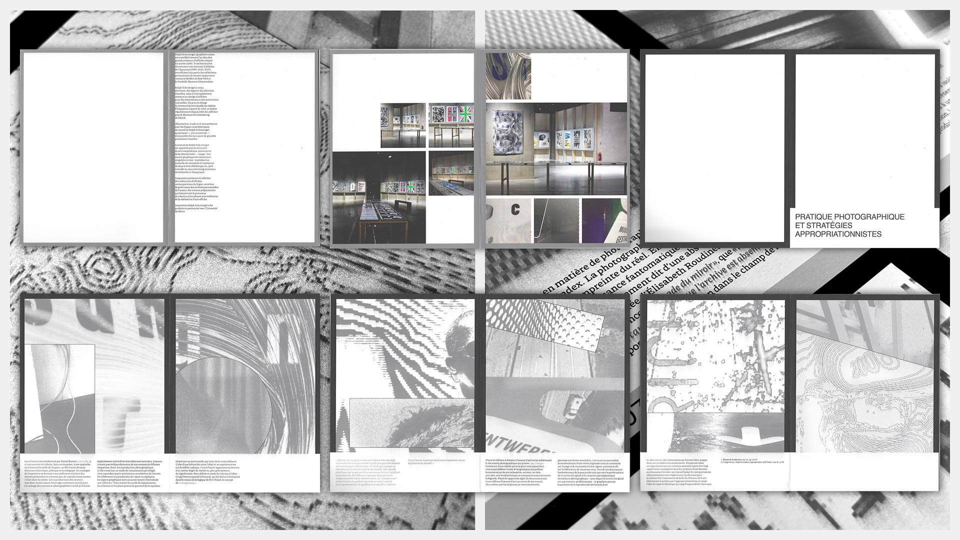
Fantasme & appropriation is a publication that explores how our visual references influence creativity. Drawing inspiration from Cécile Dazord’s text Photographic Practice and Appropriationist Strategies, the book deconstructs, reframes and recombines photographs of exhibitions and everyday surroundings to create new images.

Each visual becomes material and a sensory experience, transforming the act of appropriation into a creative process. The printed object, in black and silver, halfway between an artist’s book and an exhibition catalogue, makes the print a medium in its own right, where the work extends and reinvents itself, suggesting an infinite cycle of fantasising and visual transformation.

A set of six double-page spreads from *Fantasme & appropriation*, in black, white and grey: pages of text and photographs from Ralph Schraivogel’s exhibition, the opening page of the chapter ‘Photographic practice and appropriationist strategies’, followed by grainy, cropped and pixelated images, with columns of text at the bottom of the page
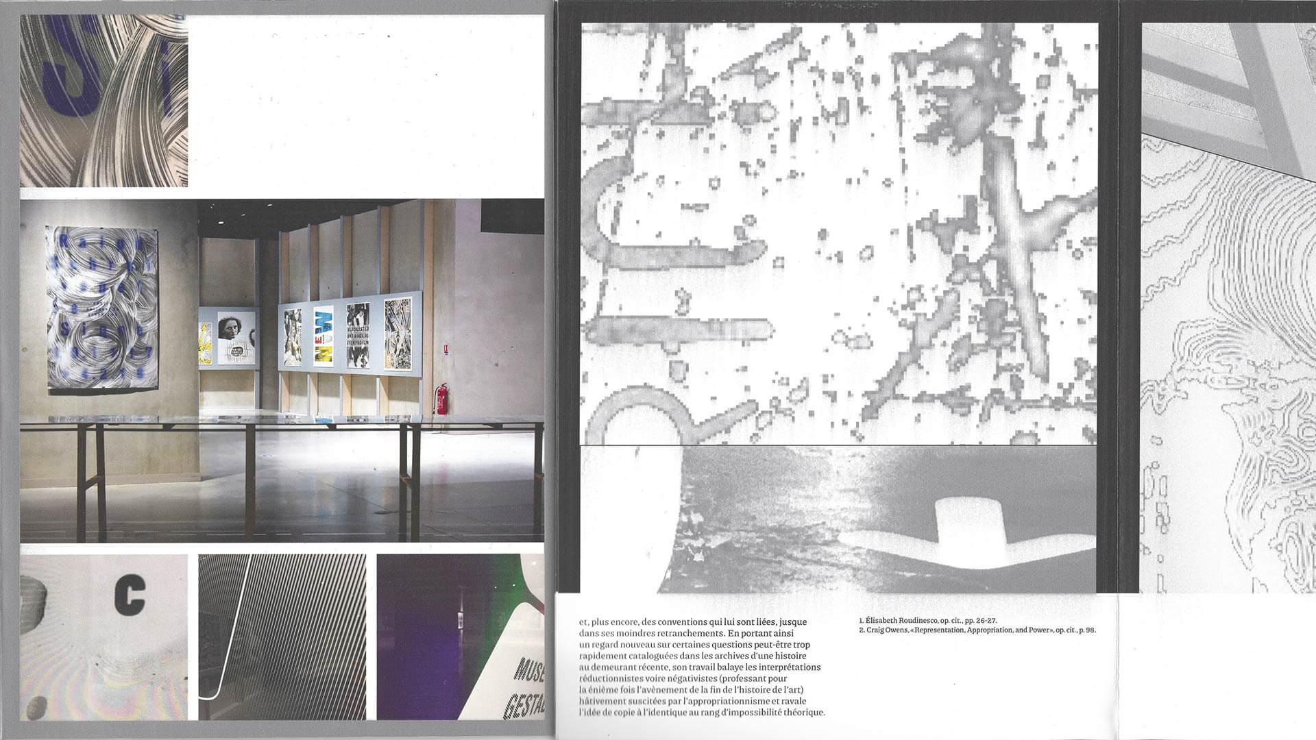
A detail from a double-page spread in *Fantasme & appropriation*: on the left, photographs of the exhibition (a large poster with swirling lines, posters on the wall, display cases) and typographical details; on the right, a pixelated greyscale image above a text with footnotes

Flouter les frontières entre design graphique et publicité