Théo Hennequin

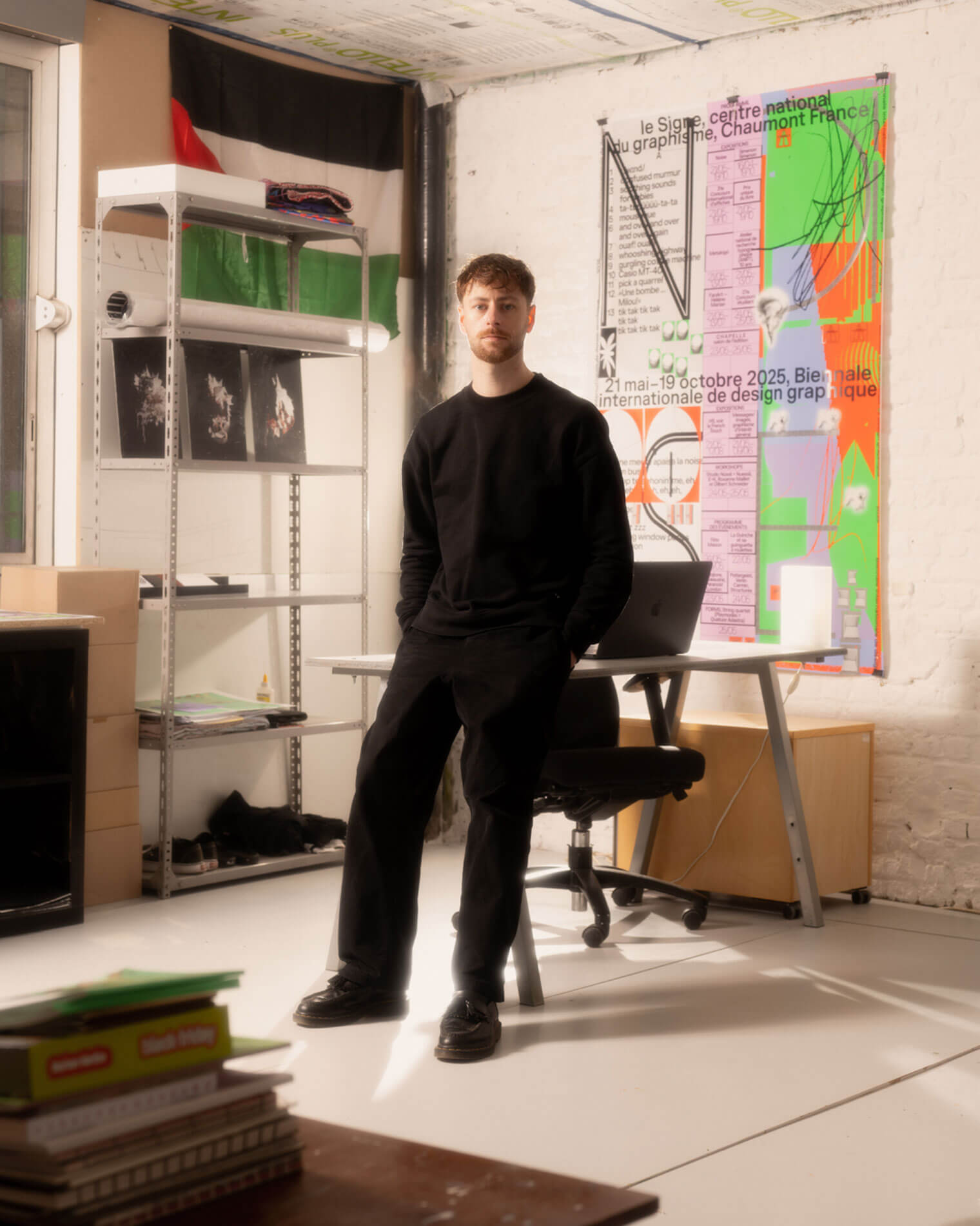
Théo Hennequin is a Brussels-based graphic designer and visual artist with a conceptually driven practice spanning culture, music and sport. He collaborates with institutions, artists, festivals and collectives, from major museums to independent structures, to articulate distinctive positions across print, digital and motion.

His practice is rooted in the circulation of images and forms between swiss rigour, experimental layering and popular cultures, from the football stand to the mountain trail, using the distance between them as a space for inquiry.


Services

Visual identity: Creation of cohesive and distinctive visual identity systems — logos, brand guidelines, posters, and print and digital applications.
Editorial design: Content layout and reflection on the physical form — books, catalogues, magazines, zines.
Motion design: Bringing images and identities to life — motion design, teasers, animated posters, projected visuals.
Web design: Custom website design, tailored to the project’s identity — portfolios, festivals, galleries, collective platforms.
Typeface design: Bespoke lettering design — brand fonts, display typefaces, lettering.

Commission

Please contact me so that I can put my skills to work for you.

Collaboration

Currently available on a freelance basis for collaborations.

Contact

hello@theohennequin.com
@theohennequin
Rue Jacques de Lalaing 13, 1040 Brussels

Selected clients

Affenpinshers, Africa Museum, Argos, Entwined, Harlem Lamine, Johan Poezevara, La Bellone, Les Chantiers Battus, Les Îles Mardi, Musique Action Chaumont, Palais de Tokyo, Traumnovelle, Toestand...
About

Toestand

2025, Brussels

Client: Toestand vzw
Collaborator: Laurent Mbaah (graphic design and web development)
Font: ModelStandard (Pizzatypefaces - Adrien Midzic and Luc Borho)

Toestand works to revitalise, through use, abandoned or forgotten buildings, plots of land and (public) spaces by organising temporary, autonomous socio-cultural centres.

The redesign of the association’s website is based on a visual concept of folders. The site’s navigation structure offers a more fluid and organised overview of the projects and initiatives organised by Toestand, presented in a minimalist style that allows the richness and colour of the images of the events and venues to shine through.

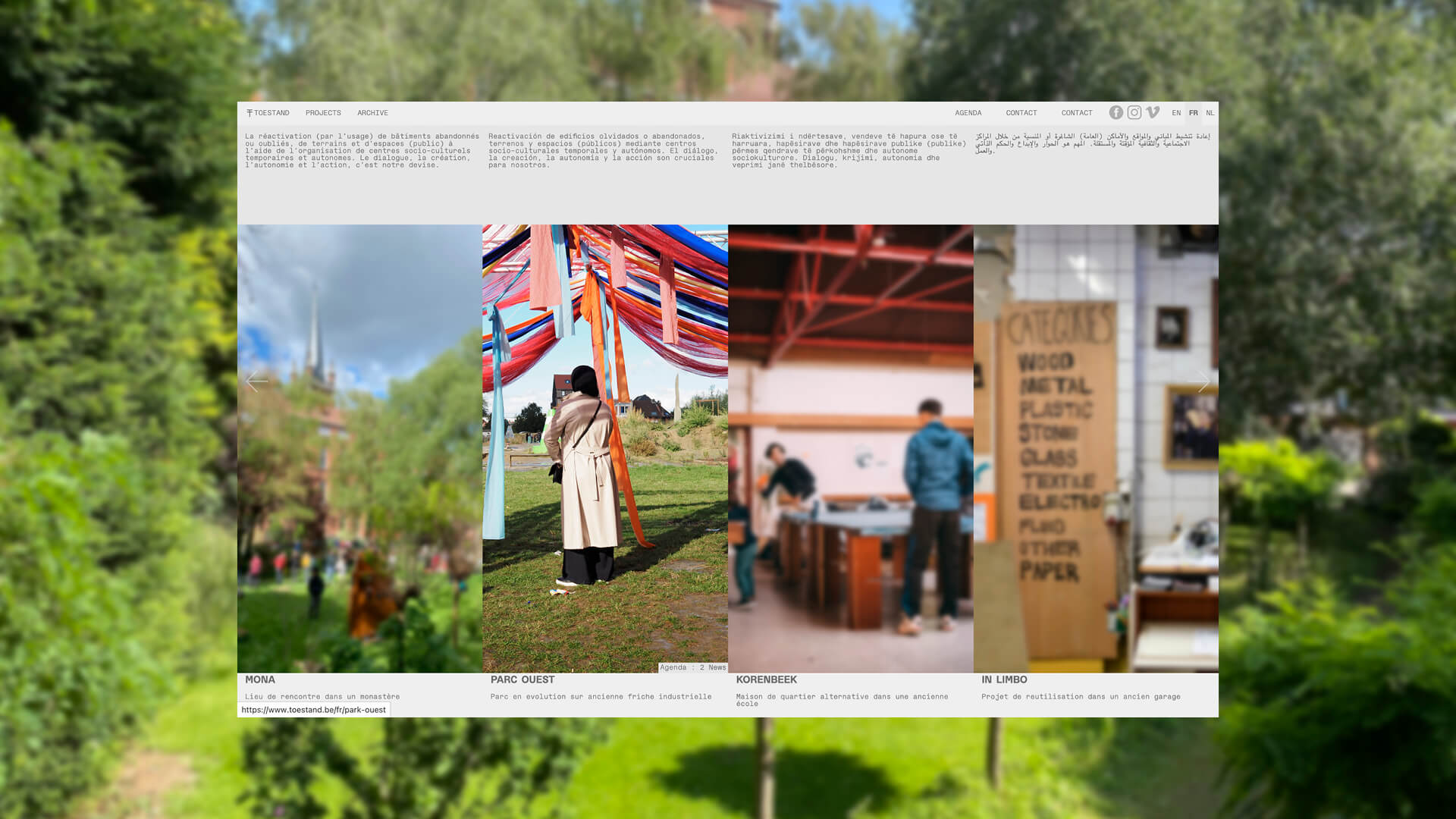
Toestand’s homepage: beneath the grey navigation bar (Projects, Archive, Agenda, Contact, Languages), an introductory sentence in five languages appears above four columns of photographs – Mona, Parc Ouest, Korenbeek and In Limbo – each captioned with a short description
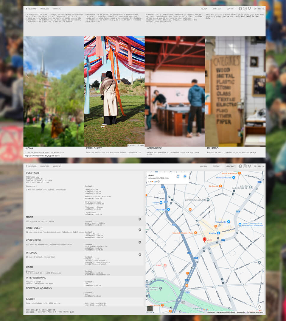
Two pages from the Toestand website displayed side by side: at the top, the home page with its four photographs of venues; below that, the Contact page, which lists the association’s address and contact details, followed by those for each venue, alongside a map showing Mona’s location in Jette
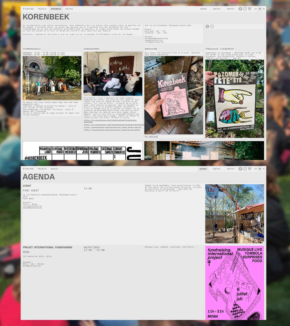
Two pages from the Toestand website displayed side by side: at the top, the Korenbeek project page, featuring opening hours, a radio programme, a leaflet and the next event; below that, the ‘Agenda’ page, which lists events accompanied by a description and a poster or photograph
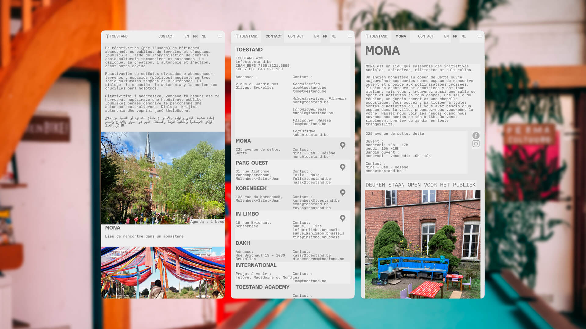
Three mobile screens from the Toestand website displayed side by side: the home page, featuring the introductory text in five languages and photographs of Mona and Parc Ouest; the Contact page, listing locations; and the Mona page, with its introductory text and a photograph of a brick courtyard and colourful furniture

N-ième galerie